Emotions guide nearly every facet of our lives.
And it’s no different when it comes to what we choose to buy.
Our purchasing decisions are largely guided by emotions rather than cold logic or stark objectivity.
Some experts even suggest that “90 percent of all purchasing decisions are made subconsciously.”
In other words, they’re based on emotions.
I think that one of the biggest mistakes marketers make with their landing pages is failing to make an emotional connection.
Sure, they present some facts, sprinkle in a bit of data, yada yada yada, but they just don’t connect on an emotional level.
Maybe this is why “only about 22 percent of businesses are satisfied with their conversion rates.”
It’s a serious problem.
From my experience, emotional advertising is by far the most critical component of a landing page.
It’s essential for getting the conversion rate you’re looking for.
I would now like to take a closer look at the science behind emotional advertising and explain how you can use certain principles to fully optimize your landing page.
Let’s dive in.
What science says
When I’m making marketing decisions, I like to use concrete data as my main guide.
One particular study that I found interesting was conducted by Martin Lindstrom who “was selected by Time Magazine as one of the ‘2009 Time 100’ for his work in the area of neuromarketing.”
In it, Martin uses the fMRT process, which is short for functional magnetic resonance imaging to “get a glimpse into the head of consumers.”
Here’s what he found:
- “Our brains usually run on autopilot, despite making us believe we know what we are doing.”
- “90 percent of all purchasing decisions are not made consciously.”
- “Most purchasing decisions take as little as 2.5 seconds.”
- “Brodmann Area 10 in the human brain’s frontal cortex is activated if someone ‘thinks a product is really cool’. This area is linked to self-awareness and emotions.”
- “Brands and products that evoke our emotions, like Apple, Coca-Cola or Nivea, always win.”
According to Peter Noel Murray Ph.D.,
fMRI neuro-imagery shows that when evaluating brands, consumers primarily use emotions (personal feelings and experiences) rather than information (brand attributes, features and facts).
The bottom line here is that we’re far from being rational creatures with our purchasing decisions.
We’re quite the opposite, actually.
At the end of the day, we’re largely compelled to buy one product over another simply because it appeals more to our emotions.
But what drives these emotions?
Emotions are ultimately interconnected with our needs.
While each person’s specific needs can vary, all humans have virtually the same basic needs, and we are continually pursuing them.
This brings me to an old school psychological concept (from 1943) that I feel still carries just as much weight today as it did back then.
It’s Maslow’s Hierarchy of Needs, which looks like this:
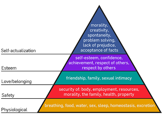
This model shows our hierarchy of needs and breaks them down in terms of importance and priority.
Our most pressing need at the moment motivates our behavior.
Whether it’s as basic as buying bottled water when we’re thirsty or buying the latest model iPhone to gain the respect and admiration of our peers, we’re always looking to have our needs fulfilled.
Your job as a marketer
When you get right down to it, your job is quite simple and breaks down into three basic steps:
- Understand the needs of your audience
- Understand what their psychological drive is compelling them to seek
- Influence their behavior to appeal to their needs
Of course, there’s a lot involved with this. It’s a huge topic to tackle.
But here are the essentials of emotional advertising on your landing page.
Following these basic principles should point you in the right direction and can increase your overall conversion rate considerably.
Start with visuals
I think we can all agree that humans respond well to visuals.
In fact, I’ve written multiple articles on the power of images.
But there’s one particular type of image you’ll want to focus on with your landing page: pictures of people.
Why?
This is one of the most effective ways to evoke an emotion in a visitor.
In fact, there’s a term in psychology known as mirroring, where “one person subconsciously imitates the gesture, speech pattern or attitude of another.”
It’s a scientific fact, ya’ll.
The trick here is to use images of people exhibiting the emotion you want your audience to feel.
Take this landing page from Lyft, for example:
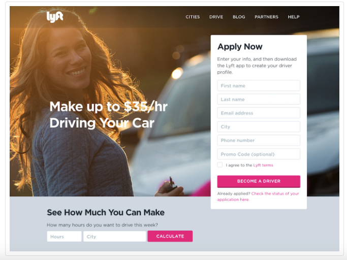
Their goal was to show how easy and enjoyable it is to make money as a Lyft driver.
And here’s another little trick.
Using images as a guide to your CTA can have a powerful impact.
According to Talia Wolf of Unbounce,
60 percent of our brain is geared towards visual context, so the first thing we see is visual. It’s important to use the images on your page in order to guide user attention.
In other words, you should use your images as directional cues whenever possible.
For instance, you might have a person looking at your CTA.
Use the right color scheme
Next, there’s the issue of color.
Color is huge, and you don’t want to haphazardly construct a landing page without taking this factor into careful consideration.
How do you choose a color scheme?
Well, it starts with understanding colors as emotional triggers.
Here’s an illustration of a color wheel to show you what I mean:
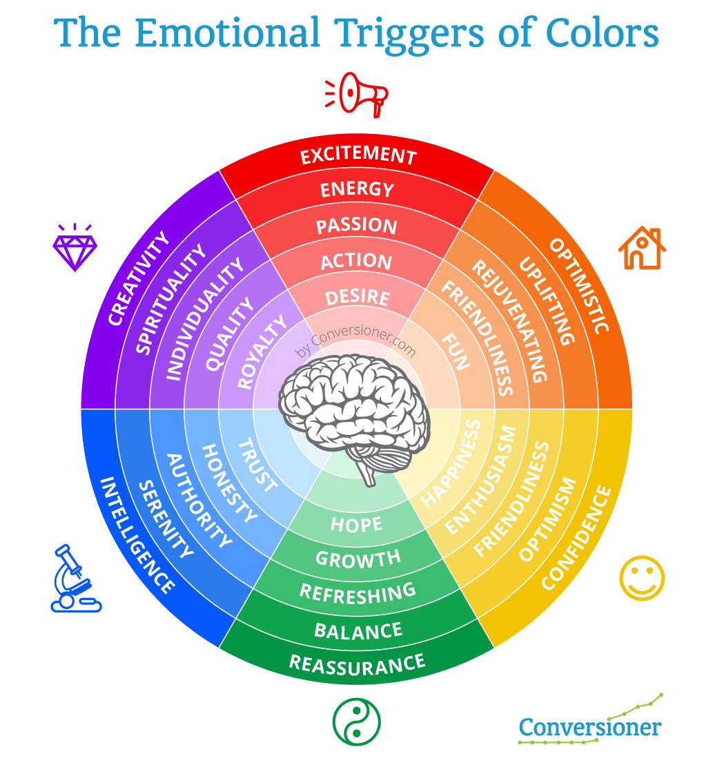
The key is to match your color scheme with the emotion(s) you’re trying to draw out of your visitors.
I’ll give you an example.
Here is a screenshot of a landing page on NeilPatel.com:
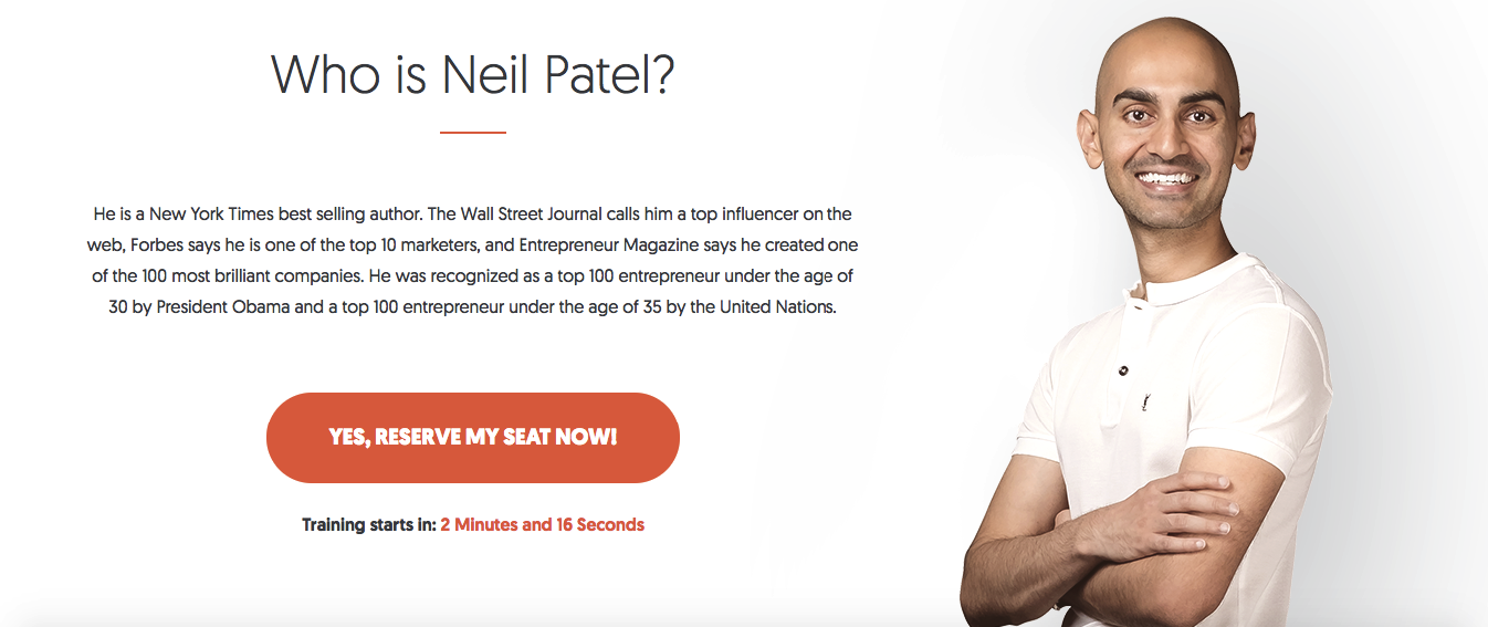
Notice that I chose orange as my color scheme. This wasn’t by chance.
My goal was to connect with optimistic business owners hungry to grow their companies. I love connecting with eager, growth-driven people. Orange is the perfect color for that!
I also wanted to convey feelings of friendliness and approachability.
Now, I’m not saying that you have to follow the color wheel to a T, but you should definitely use it as a rough guide when determining which colors to use on your landing page.
That, right there, can have a tremendous impact.
Set their minds at ease
Let’s be honest.
Many of the leads visiting your landing page will be skeptical.
There are a lot of charlatans and snake oil salesmen out there who over-promise and under-deliver.
You need to make it a point to calm your visitors’ anxieties and alleviate any fears they may have.
Below is an example of a landing page that does this well.
It’s from H.Bloom, a luxury flower delivery service:
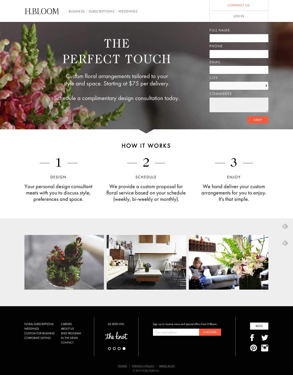
Notice how they clearly explain the three-step process of “design, schedule and enjoy.”
The page very simply highlights what people can expect if they choose to do business with H.Bloom.
Customers know that they won’t get sucked into some over-complicated service that’s only going to cause them stress.
There are several other areas you may want to address to set your leads’ minds at ease, which can include:
- testimonials from satisfied customers
- mentioning the number of customers you’ve served (e.g., over 100,000 customers have used our software)
- Trust icons like the ones at the bottom of this Shopify landing page (being featured by The Wall Street Journal, USA Today, and so on immediately adds legitimacy)
Use language that reminds visitors of their pain
If you really want to grab someone’s attention, remind them of their primary pain point.
For instance, an acne removal product might remind visitors of the distress that severe pimples are causing them.
A company selling a knee brace might remind visitors of how difficult it is living with chronic knee pain.
You don’t want to go overboard, but a subtle reminder can serve as a strong motivator to buy your product/service.
I think LifeLock really nails it with this landing page:
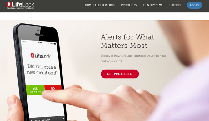
In this case, they rouse your fear of being a victim of identity theft.
The point here is to present a specific pain point and show how your product/service will alleviate it.
Use emotionally-driven words
The last thing I’d like to discuss is the actual words you use in your copy.
Copywriting relies upon more than simply writing well.
For it to be effective and turn leads into customers, it must:
- have a clearly defined purpose
- target your core audience
- be simple
- be persuasive
- lend credibility to your brand
- motivate visitors to buy
I don’t have the time here to tackle copywriting in its entirety.
But I do have a simple tip that can help you effectively evoke the right emotions from your leads.
And that’s to use emotional words.
Here’s an example of words associated with pleasant feelings:
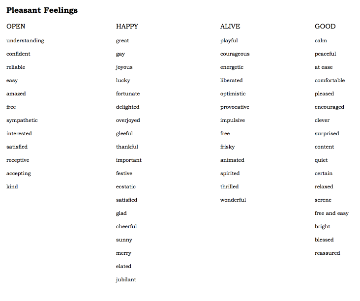
Check out this link for a more comprehensive list of emotional words. It also includes words associated with unpleasant
This list should help you decide on a few key words to include into your copy.
For a more exhaustive look at copywriting, I recommend reading The Definitive Guide to Copywriting that I co-authored.
It covers virtually everything you need to know.
Conclusion
Let’s recap.
Humans are emotional creatures, and most of our purchasing decisions are based primarily on emotion.
There’s just no getting around it.
Understanding this phenomenon is the first step to creating an airtight landing page.
By utilizing the right psychology-based strategies, such as visuals, colors, and so on, you can target key emotions and increase the odds of your leads responding favorably (making a purchase).
And the payoff is obvious: an increased conversion rate for maximum ROI.
If your landing page is lacking emotional advertising, you’ll want to address this issue right away.
Can you think of any other ways to target landing page visitors on an emotional level?

