Recently, I stumbled upon a scary statistic.
A whopping 69.23% of ecommerce shopping carts are abandoned.
To put this into perspective, for every 100 customers who start the checkout process, 69 don’t finish.
Is it a massive problem? Absolutely.
These numbers shouldn’t sit right with any business owner. That’s too many lost sales and potential lifelong customers.
But it’s also a bit surprising.
If someone starts the checkout process, it stands to reason they have a strong purchase intent.
So, why do so many shoppers fail to complete their purchases?
A few reasons.
Some of these are out of your control, and others, you can nip in the bud:
- your site isn’t designed well, affecting the user experience;
- the site has technical bugs;
- site visitors are just window shopping;
- your checkout process has too many pitfalls.
These are just a few ideas.
Can you guess which one is the most pervasive?
That’s right.
Your checkout process is turning potential customers away.
Take a look at this chart:
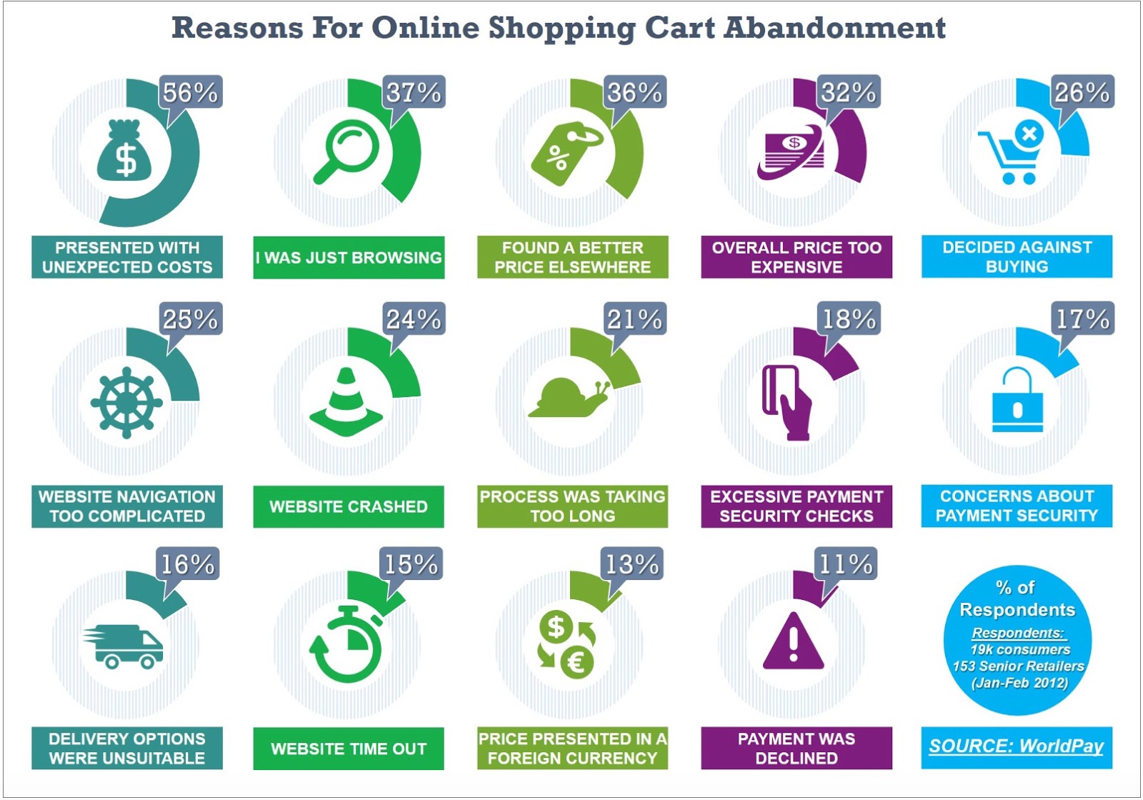
Out of all the reasons why shoppers abandon their carts, a majority are related to the checkout phase.
Does this apply to all businesses? Not necessarily.
Don’t get me wrong.
All businesses—no matter how upscale—suffer from shopping cart abandonment.
You can’t do anything about a user who is just browsing. They may just want to save their favorite items in the cart for future reference.
With that said, there are varying reasons why shoppers do not complete a purchase.
In this article, you’ll find out if your checkout process is the main culprit and what you can do about it.
First, I’ll give you the common checkout pitfalls that turn potential customers away.
Then, we’ll get into a data-driven litmus test so you can know for sure.
This way, you won’t make changes to your site based on a hunch. That’s never good for business.
Sound good? Let’s start.
Five common pitfalls in the checkout process
If any of the following applies to your checkout process, it will certainly cause a percentage of shoppers to abandon their carts.
The great news?
It’s within your control.
Most times, a simple tweak is enough to make all the difference.
1. You haven’t earned the trust of potential customers
This is a big one.
If people don’t trust your site, there’s no way they’ll buy anything from you.
Your product could change their lives. It doesn’t matter.
The bottom line is, customers have to put in their personal information to complete the transaction.
If you don’t do everything in your power to make them feel secure doing so, you’ve lost them for good.
The solution
Step #1: Place testimonials and other proof elements on your checkout page.
Social proof is one of the most crucial elements to include on every page of your ecommerce site.
It’s especially powerful on the checkout page as it gives customers who may be hesitant an extra push.
Here’s a creative form of social proof from The Freedom Journal:

Step #2: Add credit card icons and other trust badges to reassure customers their payment information is secure.

The placement of these badges is also important.
I recommend placing them right where customers have to put in their payment details and next to the “buy now” call to action.
Like this:

Step #3: Make sure you have contact information in clear sight. This way, customers know you’re not going to take their money and make a run for it.
Letting them know you can easily be reached is a small but impactful trust indicator.
Here’s an example from Amy Porterfield:
2. Additional costs blindside customers
Here’s the thing.
When the average person shops, they have a price point they’re willing to reach. As such, they choose items within these parameters.
After that has been surpassed, it’s a no-go.
When you surprise customers with high shipping costs, the immediate reaction is to make a dive for the exit.
And it’s with good reason.
I’ve seen instances where shipping, handling, and taxes amount to the price of the items in the cart.
That’s crazy.
It’s no wonder this is the number one reason people don’t complete their purchases.
![]()
The solution
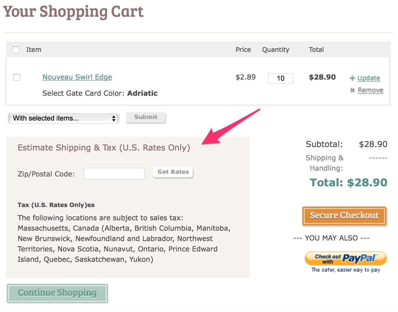
Step #1: Let shoppers know their shipping costs early in the checkout process.
You can do this by introducing a shipping calculator to provide an estimate of the additional costs to be covered.
Here’s an example:
Step #2: Offer free shipping.
While this may not be feasible for everyone, it’s wise to find ways you can reduce costs for customers.
Many businesses offer free shipping once shoppers reach a certain price threshold.
Like this example from Fashion Nova:

As customers add new items to their carts, they’re reminded of how much more they need to spend to meet the threshold.

Very clever.
Step #3: Have coupon codes on your site.
It’s important to have these discount offers on your site.
Why does that matter?
When customers go browsing elsewhere for coupons and don’t find them, they rarely come back.
You want to avoid that.
This beauty brand has a deal where they provide a daily coupon:

This way, customers can easily save on shipping costs.
3. The checkout process is too time-consuming
When they’re checking out, the only thing your customers value more than your product is their time.
That means that anything in your checkout process that takes too long is a problem.
Here are some examples:
- technical glitches
- slow site
- poor design
- lack of mobile friendliness
- complicated navigation
- long-winded checkout process
Website speed is a big deal for users: 40% of shoppers will abandon your site if it takes longer than 3 seconds to load.

You can imagine that any issue which zaps customers of their time will have the same effect.
The solution
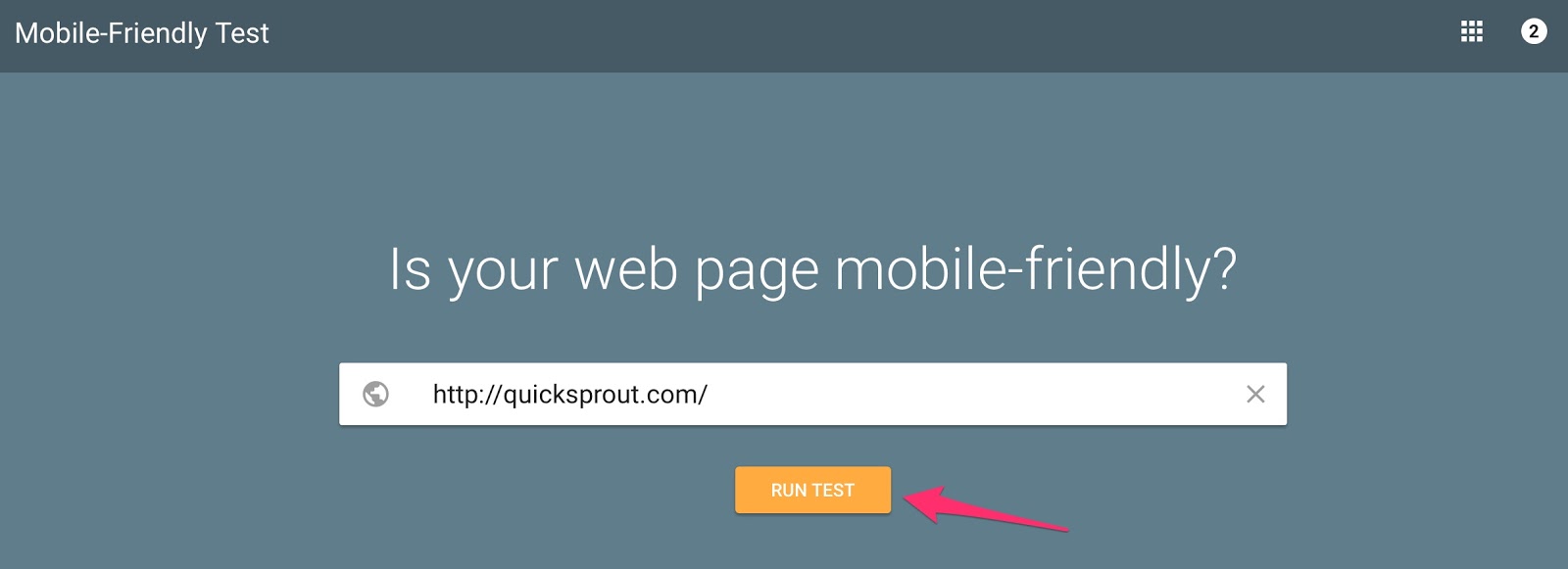
Step #1: Test the speed and mobile-friendliness of your website. Make immediate adjustment if it’s not up to par.
You can use Google’s mobile friendly test.
Step #2: Have a simple checkout process with as few form fields as possible.
Ideally, customers want to sprint through this process. The easier you make it, the more likely they will go through with their purchases.
4. There’s not enough urgency to compel customers to act
Urgency as a sales strategy is about inspiring customers to take earnest and swift action.
It’s super simple to implement, and it has a massive impact.
Many businesses don’t flip this proven psychological switch when it matters most.
As we’ve seen before, a few of the reasons for shopping cart abandonment may be out of your control.
However, you can still have a measure of influence.
For instance, if you added a few urgency elements during checkout, it may entice window shoppers to make a purchase.
Think about the last time you bought something you didn’t intend to because the deal was too sweet to pass up.
It happens to the most disciplined of us.
The bottom line?
Without urgency elements, you’re missing out on a massive opportunity.
The solution
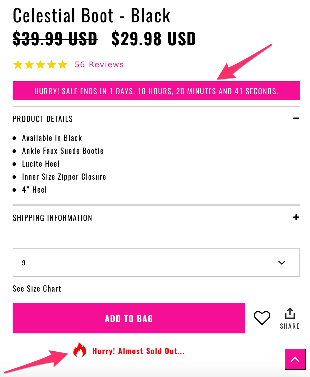
Step #1: Let customers know when an item is almost sold out. That increases the incentive to get it immediately.
Here’s an example:
Step #2: Use the language of immediacy.
Words like “instantly,” “today,” and “now” are all useful in that regard. I also recommend using active verbs and power words to encourage people to act right away.
Step #3: Satisfy your customers’ need for instant gratification.
Here’s what that means:

You want to give customers a sense that they’ll get what they want immediately.
This is an innate human need.
If you appeal to it, your customers will respond.
If you’re selling an information product, instant gratification is easy to provide. Your customers can have electronic access without delay.
But it’s trickier when you’re selling a product that has to be shipped.
My advice?
Take a page out of Amazon’s playbook.
They do this brilliantly.
Here’s what I mean:

If you know your items will be delivered to you in a couple of days, chances are you’ll be more likely to check out ASAP.
5. There’s not enough information on the checkout page
Nothing kills action like uncertainty.
If you don’t provide enough information on the checkout page, customers are likely to be unsure of the process.
They’ll start second-guessing their decisions and won’t complete their purchases.
The solution
Step #1: Include product details on the checkout page.
It’s a good practice to remind customers what they’re paying for and how much.
Here is an example from WebinarJam.
When you select a plan, they let you know what you’ve chosen. They also give you the next steps in the checkout process.

Step #2: Ensure there’s continuity between what’s on a product page and what’s displayed on the checkout page.
Has this ever happened to you?
You read the product page thoroughly and place the item in your cart only to find different information on the checkout page.
Even if it’s something slight, I assure you, it deters many people from completing the transaction.
Step #3: Include support options on the checkout page.
Consider having a live chat, email support, phone support, and a link to a FAQ page.
You don’t need to have all of these, but one or two will go a long way in securing the trust of customers.
It will also help move the purchase along if customers have a legitimate problem that needs to be taken care of before they go through with a transaction.
I’ve highlighted the common reasons why your checkout page may cause shoppers to abandon their carts.
The truth is, you need to consider your circumstances.
Sure, the “best practices” are useful.
But without concrete analytics, you’ll be making changes blindly.
A data-driven approach to dealing with shopping cart abandonment
Want to find out the exact cause of your shopping cart abandonment?
Google Analytics is the tool to use.
It’s simple. I’ll give you a step-by-step play.
Step #1: Find the “Admin” tab so you can create a conversion goal:
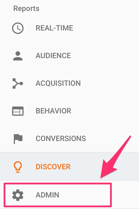
This is so you can track the actions your web visitors take.
Click on “Goals”:

Step #2: Create a new goal and set it up to track a completed transaction.

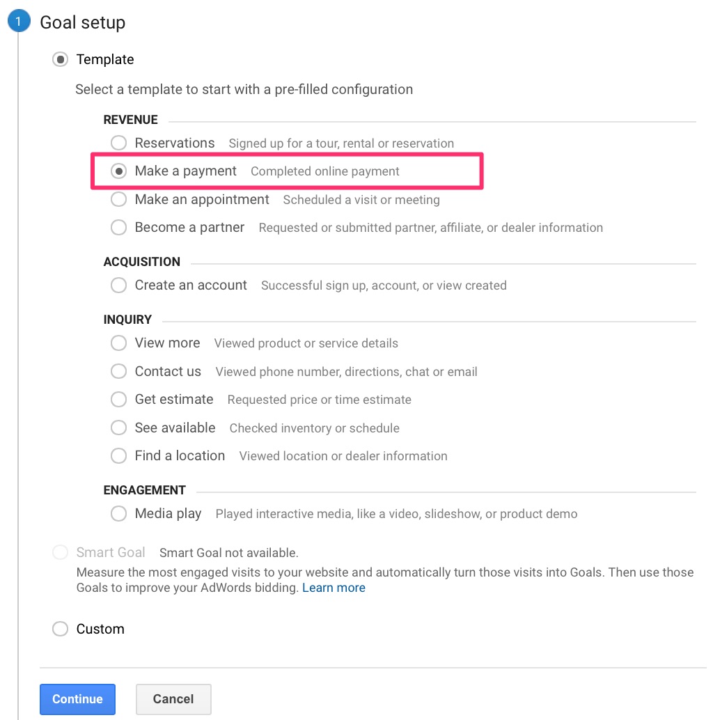
In the first step of the goal setup, select an appropriate template.
While you’re tracking cart abandonment, your ultimate goal is to get customers to make a completed online payment.
Select that option:
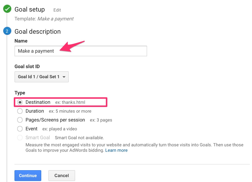
It’s time to describe your goal.
Name your goal, and select “Destination” as the goal type.
The destination can be a thank-you page, which will help you track the number of completed purchases.
Next, you want to set the URL of your Destination.
As I mentioned, this could be any page that customers are directed to after their purchases.
The only reason someone would be on this page is if they completed a transaction, right?
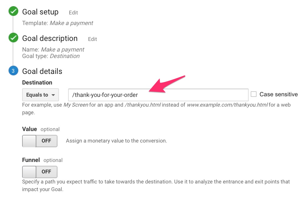
Step #3: Map the path customers take leading up to complete a transaction.
This is what will help you determine where the pitfalls in your sales funnel are.
In the same “Goal details” section, switch the Funnel option to “ON.”
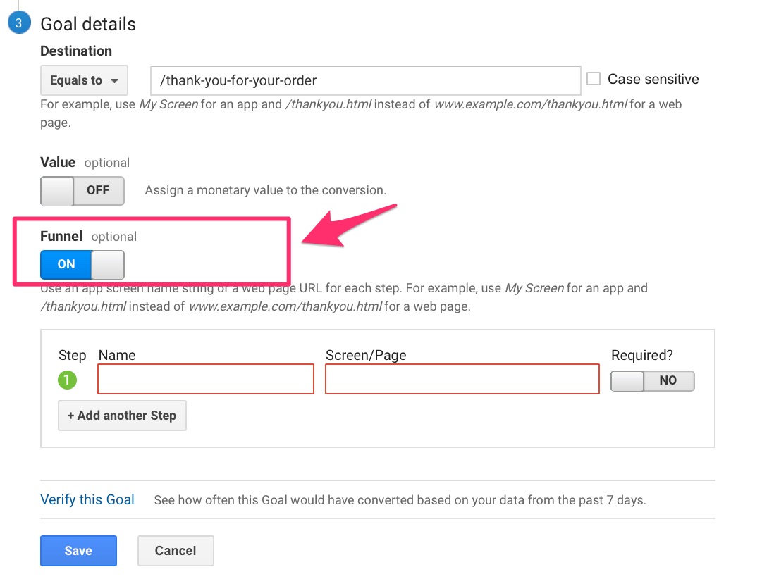
List all the steps that customers take leading up to the purchase. Name each step, and add the corresponding URL.
Like this:
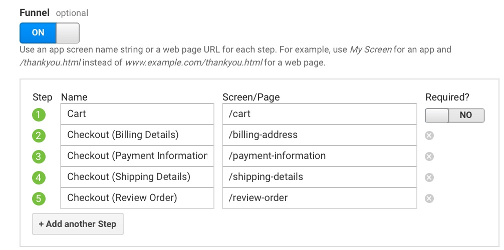
If you have a one-page checkout, only include that page, of course.
Whatever steps customers take, include them all.
You may want to go through the process yourself to make sure.
Save your goal, and that’s it for the setup. Tracking will begin, and you’ll now have detailed data for each step of your funnel.
Step #4: Check your reports to analyze the data.
Here’s where to find them.
Under “Conversions,” click on “Goals.”
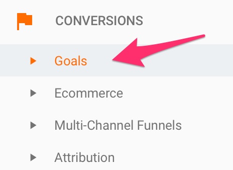
Pay special attention to “Funnel Visualization.”
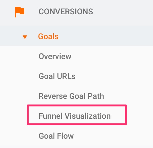
You’ll see an illustration that looks something like this:
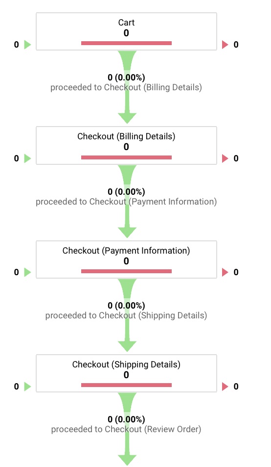
I just created this, so there’s no data. It will take some time for yours to show up as well.
This data will tell you where in your funnel customers are jumping ship. It will also tell you in how many sessions your goal was completed.
Useful, right?
You’ll have a complete view of the way customers move through your funnel. You can now make informed adjustments to decrease your shopping cart abandonment rate.
You should know this though: there’ll always be customers who drop out before completing a purchase.
That’s just the nature of the game.
You can optimize your process to reduce that percentage significantly.
But will the lost sales be lost forever?
Can they be salvaged?
They can, and I’ll tell you how.
The ultimate solution to recovering abandoned carts
I hate to bring up this depressing statistic again, but only 3 out of 10 shoppers complete their purchases.
There is, however, a simple follow-up step that can increase that number significantly.
Crazily enough, most businesses don’t take advantage of it.
I’m referring to cart abandonment emails.
This could be one email or a whole sequence. You decide.
The point of these emails is to recover lost sales. If a customer adds items to their cart and leaves without checking out, be sure to follow up via email.
Here’s a brilliant example from Vanity Planet:
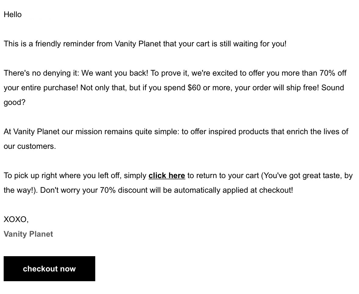
Many things are going right in this email. It:
- offers a massive discount
- includes a free shipping offer
- uses personal and persuasive language
- provides a simple solution for returning to cart
- has a direct link to checkout
They made an irresistible offer.
Many people would go back to complete their purchases in a heartbeat.
When cart abandonment emails are done right, they’re hands down the most powerful solution to recapture lost sales.
I highly recommend you test this strategy and watch it make a difference.
Conclusion
Dealing with shopping cart abandonment can be daunting.
It’s also frustrating when more than half of your prospects aren’t converting into sales—and you don’t know why.
There is any number of reasons why it might happen.
And to be frank, some of them are inevitable.
But others? You can do something about.
For many businesses, the checkout process is the biggest culprit when it comes to lost sales. I’ve pinpointed some of the most common issues and their fixes in this article.
Use them as a litmus test.
But don’t stop there.
I can tell you that applying best practices only to your checkout pages won’t transform your sales funnel.
It’s crucial you take a more data-backed strategy to deal with abandoned carts.
Include Google Analytics in your arsenal, and set up conversion goals.
This way, you’ll have detailed analytics to make the sort of changes that will maximize your profits.
What do you think is the best strategy to ensure customers complete their purchases?
