How are you handling your shopping cart abandonment?
The first step is for you to track and recognize how many shoppers are leaving items in their carts without finalizing the purchases.
If you’re not addressing it, you’re missing out on sales.
Take a moment to ask yourself how you can improve the customer experience.
Is there a problem with your conversion funnel?
This is a basic visualization of how companies create conversions.
First, the consumer becomes aware of your brand, products, or services.
Next, they have a need or want that sparks interest in something more specific.
Once the consumer knows what they want, they consider the purchase.
Adding a product to their shopping cart definitely qualifies as the consideration part of this conversion funnel process.
They are just one step away—or even one click away—from finalizing the sale.
So, what’s the problem?
Let’s take a look at a conversion funnel with some holes in the process:
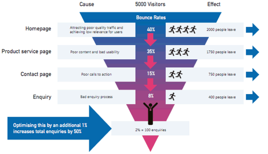
If customers are getting all the way to the shopping cart, I’m willing to bet you don’t have a problem with your homepage or product service page.
What about your contact page or customer service information availability?
It’s possible the customer doesn’t feel comfortable finalizing the purchase based on the provided information about your business, reputation, warranty, or return policy.
But again, they’ve already made it to the checkout page with items in the cart.
So, I think this is another unlikely scenario.
The issue has to be in the final step of your conversion process.
I’ll show you some techniques that will minimize shopping cart abandonment on your platform and increase your conversion rates.
1. Recognize that customers are price sensitive
Your prices may be deterring the consumer from finalizing their purchase.
Look, I get it.
Obviously, you’re trying to make a buck.
I’m not telling you to start giving everything away.
You should be making a healthy profit on each transaction.
With that in mind, let’s take a look at some numbers:
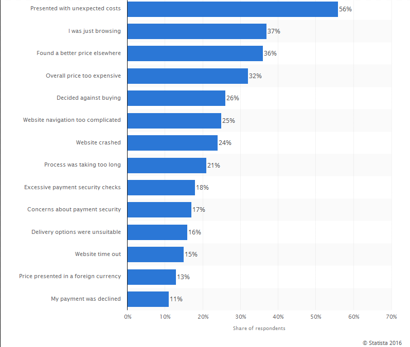
Unexpected prices are the number one reason why customers are abandoning shopping carts.
So, the initial price of your item might be okay.
But the added charges are turning customers away.
Some examples of these extra charges may include:
- Sales tax
- Shipping
- Processing fees
- Any other hidden charges
Is there a way you can eliminate some of these?
Here’s an idea.
Maybe you can take on the shipping fee.
Instead of putting that burden on the customer, you can adjust the original prices of your products to account for the shipping charges.
Will the customer end up paying more?
Yes.
But it’s not an unexpected charge.
You’ve got to find a middle ground.
Based on the graph above, the price was a factor in three of the top four reasons why people abandon shopping carts.
Try to keep your prices competitive while still generating a nice profit.
You may end up making slightly less money each transaction, but it’s worth it if you can increase the transaction rate.
2. Make sure your website and checkout procedures are secure
In the last five years, 46% of Americans were victims of credit card fraud.
That’s an alarming number.
Americans are the targets of nearly half of all the credit card breaches worldwide.
Consider these numbers for a second.
Have you had a credit card breached?
Do you know someone who’s been a victim of credit card fraud?
This is a legitimate concern for people.
Your customers may have had a bad experience in the past, and that is making them hesitant about online purchases.
The purchase process on your website needs to be secure.

You are responsible for your customers’ credit card information.
Don’t be the reason for their accounts getting hacked.
Take the proper security measures and place the corresponding badges on the checkout page, similar to the graphic above.
Make sure your website is secure.
Is your website running on an HTTPS connection?
Look at the example from Dick’s Sporting Goods:
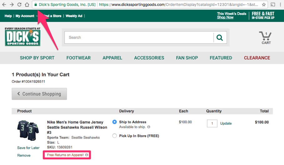
See the secure sign?
It makes the consumer feel more comfortable at the checkout page.
Personally, it’s a red flag for me if I don’t see this while I’m shopping.
I won’t be entering any of my personal or credit card information on a web page that’s not secure.
Quick side note: notice Dick’s offers free returns on its apparel?
I wanted to point that out as well. It makes the customer feel better about the checkout process.
A secure website and checkout process need to be a priority for your ecommerce store.
3. Allow your customers to check out without creating a profile
Obviously, you want customers to have an account with your company.
It’s a great way to track their behavior and keep them informed of special offers and promotions.
However, you shouldn’t be forcing people to create a user profile just to make a purchase.
Why?
- It’s an extra step. People are in a rush, and you want the procedure to be quick.
- They may have a fear of getting unwanted emails, text messages, or junk mail.
If your website doesn’t have a guest checkout option, you’re making a mistake.
Here’s an example from Lululemon of the guest checkout option:
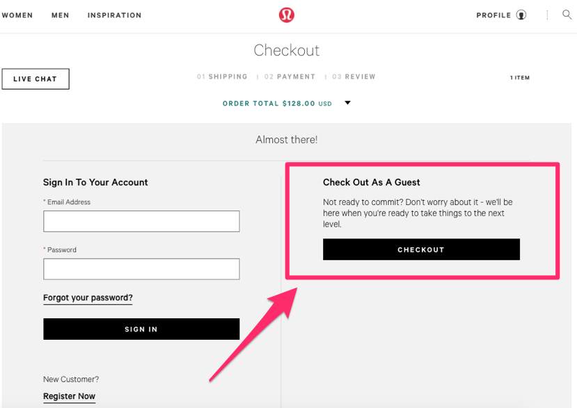
It’s a really clean checkout page.
There are two clear options.
Returning users can easily sign into their accounts, and customers without an account can proceed without creating one.
This ensures you aren’t losing sales.
Here’s the thing, though. In order to complete the checkout process, the customer still needs to enter their information.
You’ll have their name, email address, location, and other information.
Once the sale is final, you can entice them to create an account.
All they need to do is create a password.
You already have everything else in your records, so they don’t need to submit information twice.
Here’s a great example of what this should look like:
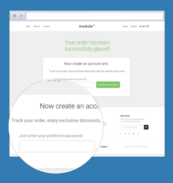
Give the customer a reason to create an account.
Refer to the image above.
What’s the customer getting in return?
- Option to track the order
- Exclusive discounts
But they shouldn’t be forced to create a profile just to make a purchase.
Make sure that’s optional.
4. Accept a wide range of payment options for the customer
What kind of payment options are you accepting?
Visa only?
You don’t accept Discover cards?
I understand.
Certain credit card companies have higher processing fees than others.
Accepting transactions from PayPal or similar platforms could be even more costly.
By not accepting certain payment methods, you could be turning customers away.
You might think that everyone has one of the credit cards you accept, but that’s not always the case.
Give the consumer lots of options.
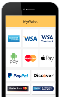
Do you accept Apple Pay?
There are nearly 86 million iPhone users in the United States.
Last year, Apply pay transactions grew at a 50% rate.
These numbers show alternative payment methods are trending upward.
Don’t fall behind the curve.
If you’re accepting only one or two payment forms, it could be the cause for your shopping cart abandonment.
The customer gets to the checkout process only to discover you’re not offering their preferred payment option.
5. The process needs to be mobile friendly
Is your website mobile friendly?
Is the checkout procedure optimized for mobile devices?
It needs to be.
Research shows 84% of smartphone users have experienced a problem completing a mobile transaction.
And 40% of users will go to your competitor after an unsatisfactory experience on your mobile site.
What do these numbers tell you?
People want to shop on their phones.
Here’s some additional information about mobile users:
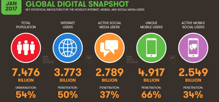
Nearly 5 billion people have a mobile device across the world.
Of course, not all these people are your potential customers.
But a large chunk of them could be.
Don’t alienate people from shopping on their mobile devices.
It’s estimated that half of ecommerce transactions take place on mobile platforms.
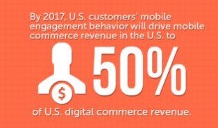
That number is only going to grow.
If getting to a laptop or desktop is the only way for your customers to shop, it could be hurting your sales.
Make sure your checkout procedure is optimized for mobile devices to decrease your shopping cart abandonment rates.
6. Don’t let your competitors steal your customers
How unique is your product or service?
Chances are, you don’t own the space outright.
You have plenty of competition.
It’s not always easy to compete with the big players like Amazon or Walmart.
Earlier we looked at a graph that said 36% of shoppers abandoned a shopping cart because they found a better price elsewhere.
If your prices are higher, that needs to be justified.
Make sure your quality and service are outstanding.
Your customer needs to understand this.
The website needs to load fast.
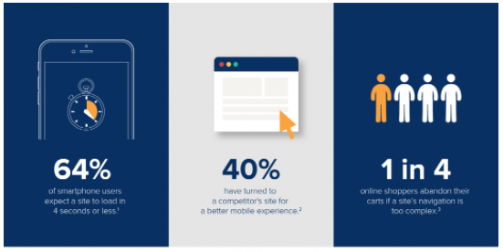
Don’t make the process too complex.
We know that 25% of shoppers will abandon their shopping carts if the navigation is too complicated.
They will go to your competitors instead.
Be aware of how your competitors are operating.
It’s always helpful to use competitor analysis tools to improve your traffic.
7. Send an email reminder if a cart is abandoned
Okay. So you may not be able to prevent everyone from abandoning their shopping carts.
Even if you decrease the abandonment rate, you won’t get that number down to zero.
Where do you go from here?
Don’t give up just because a customer abandoned their cart.
If you have their information, reach out and send them a reminder.
Here’s a great example from Saatchi Art:
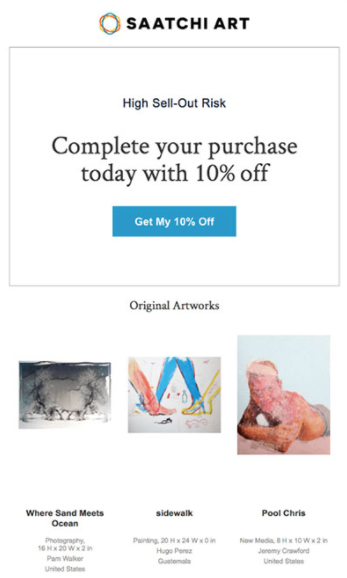
This email accomplishes a few things:
- reminds the customer of their shopping
- creates a sense of urgency
- offers an extra incentive
The reminder alone may be enough to get the customer to finalize their purchase.
But if it’s not, it creates a sense of urgency by saying “high sell-out risk.”
We’ll get into some more detail on this method shortly.
It also provides an extra incentive by offering a 10% discount.
Earlier we discussed that customers are price sensitive.
They may have abandoned the cart for financial reasons.
Giving the consumer a discount will show them you care.
That promotion may be enough of a reason for them to finish the checkout.
8. Use A/B testing to simplify your checkout process
How long does it take the customers to make a purchase on your site?
Every extra click they have to make gives them a chance to second-guess their decision.
You can run an A/B test to see which checkout procedure is more successful.
Let’s look at a couple of examples.
Here’s the checkout progress bar from Crate & Barrel:

It’s a quick checkout process.
- Shipping info
- Payment info
- Place order
Three steps and done.
Here’s an example from another website:

Their process is six steps.
That’s double the number of Crate & Barrel’s process.
If you have a long checkout system, I suggest you shorten the process significantly.
Still not convinced?
Run an A/B test.
Use your current system as the control group and a shorter version as the experimental group.
See if you notice a difference in your shopping cart abandonment statistics between these two groups.
9. Create a sense of urgency
Earlier I mentioned that Saatchi Art created a sense of urgency with their abandonment recovery email.
FOMO—the fear of missing out.
You can do this on your checkout page as well to reduce cart abandonment.
Some customers are just browsing.
New customers most likely won’t buy something on their first visit to your website.
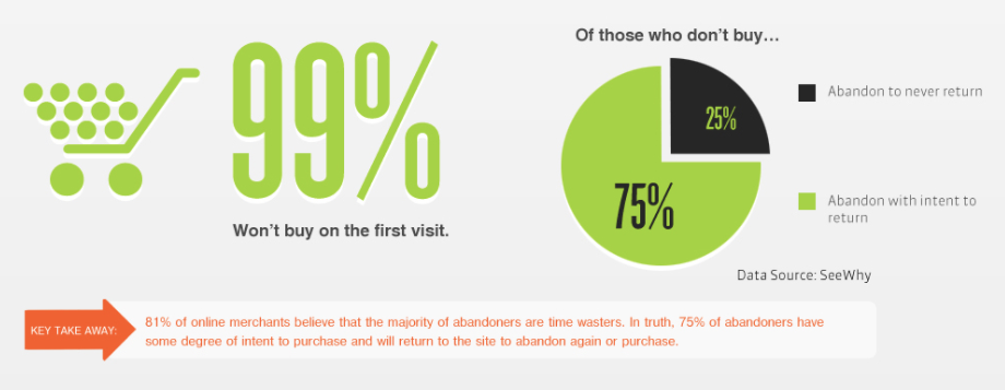
But you can give them an extra incentive to finalize their purchases.
Create a sense of urgency.
- “Limited quantity remaining”
- “Sale price expires at midnight”
- “14 people booked this flight in the last 24 hours”
- “9 other people are looking at this room right now”
I’m sure you’ve seen phrasing like this before while browsing online.
Hotels and airlines do this all the time.
Act now, or miss out.
You can incorporate this psychological strategy into your checkout process to minimize cart abandonment.
Conclusion
Shopping cart abandonment is a problem for your ecommerce website.
You’re not alone.
It’s not too late to make changes to your checkout process to prevent future cart abandonment.
Follow the advice above to keep your abandonment rates low while increasing your conversion rates and revenue.
Customers are price sensitive. Don’t hit them with any unexpected charges.
You need to accept multiple forms of payment while also making sure the payment procedure is completely secure. Customers won’t shop on your website if they think their credit card information is at risk.
Don’t force shoppers to create a customer profile to check out. Instead, offer a user account as an option after they complete the process.
Make sure your site is optimized for mobile devices. If not, your customers will go to your competition.
The checkout process needs to be short. You can run an A/B test to play with different options and formats.
Create a sense of urgency to avoid cart abandonment: if the customer doesn’t act now, they may not be able to get this product in the future.
Even if someone abandons their cart, it’s not too late. Send them an email to remind them about the product.
You can also offer a discount or promotion as an extra incentive to finalize the sale.
How will you implement these methods on your ecommerce checkout page to minimize shopping cart abandonment rates?
