Conversion rate optimization has never been bigger than it is today.
Just look at how much interest in conversion rate optimization has increased over the past decade:

And there are more and more conversion rate optimization (CRO) agencies popping up every day.
A quick search on Google for “conversion rate optimization agency” gave me nearly one million results:

This tells me one thing: many companies have lousy conversion rates.
According to Econsultancy, “only about 22 percent of businesses are satisfied with their conversion rates.”
So, what’s going wrong?
The issue with CRO is that there is a plethora of potential problem areas.
It’s not always easy to pinpoint precisely where the issue lies.
But based on my experience and research, there are 15 primary conversion roadblocks that disrupt the process and turn would-be customers away.
If your conversions aren’t where they should be, it’s very possible that at least one of these issues is the culprit.
In this post, I describe these problem areas and offer advice on how to fix them.
I’ll start with the more technical aspects and work my way down to onsite content and, ultimately, the checkout process itself.
1. Slow load time
Before you can ever spark initial interest, you must get visitors to actually browse through your site.
If they abandon your site before it loads, you’re guaranteed to have a zero percent conversion rate.
Not good.
Quite honestly, slow load time is an issue that still plagues many companies today, and that’s because people have little patience.
Here’s what I mean.
Research has found that “nearly half of web users expect a site to load in 2 seconds or less, and they tend to abandon a site that isn’t loaded within 3 seconds.”
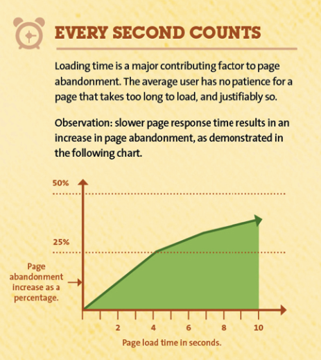
In the case of website conversions, a lack of speed kills.
If you think this is a problem for you, I recommend checking out these two resources:
10 Ways to Speed Up Your Website — and Improve Conversion by 7 Percent
How to Make Your Site Insanely Fast
2. Wrong color scheme
When it comes to choosing the color for a site’s design, I feel like many people just use something they think looks cool.
Often, they don’t consider the underlying psychology behind a particular color scheme.
But color may play a bigger role in conversions than you may think.
In fact, “studies suggest that people make a subconscious judgment about a product within 90 seconds of initial viewing. Up to 90 percent of that assessment is based on color alone.”
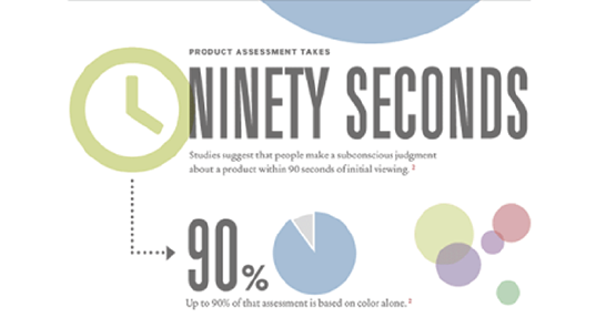
Here are some examples of the meanings of certain colors in the Western world:
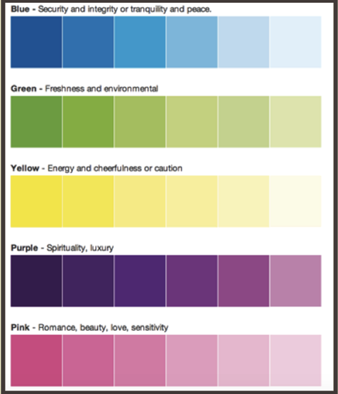
The point I’m trying to make here is that you shouldn’t haphazardly choose a color scheme.
Instead, you should carefully choose colors based on the type of emotion you want visitors to feel.
It can have a tremendous impact on conversions and put leads in the buying mindset.
For more on this topic, check out these two resources:
The Complete Guide to Understanding Consumer Psychology
The Psychology of Color: How to Use Colors to Increase Conversion Rate
3. Confusing navigation
Two words should define your site’s navigation: simple and intuitive.
If your navigation is in any way confusing or complicated, your conversion rate is likely to take a hit.
Allow me to provide you with a couple of examples of this.
Here’s a site where navigation is in a non-standard location:
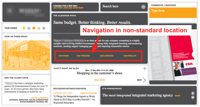
This can throw people off because they’re expecting to find it at the top or on either side of the page.
Another mistake that can be a conversion roadblock is having too many navigation items:
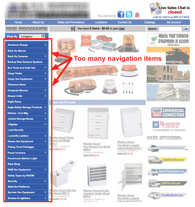
This can have a paralyzing effect on visitors: they will likely become so overwhelmed that they won’t know where to get started.
Either one of these issues is going to lead to a high bounce rate and low conversions.
The fix is to keep it simple and intuitive, which you can learn more about in this post from Kissmetrics.
4. Cluttered design
Have you ever come across something like this?
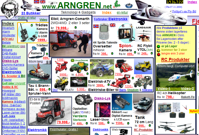
Or this?

These sites are messy, cluttered and can lead to a cognitive overload, which isn’t going to do your conversion rate any favors.
I enjoy sites with a minimalist feel, like this:
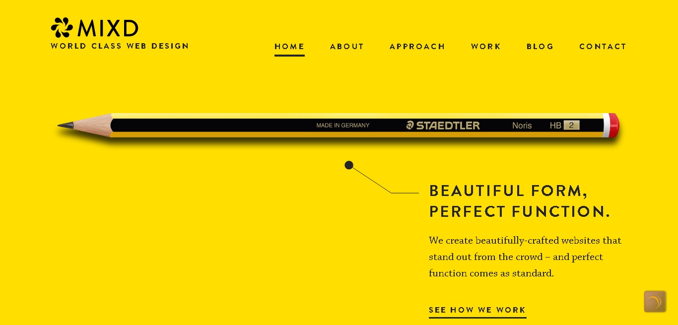
In fact, that’s what I aim for on Quick Sprout, Crazy Egg, and NeilPatel.com.
I recommend doing the same for your website.
Although you don’t necessarily want it to seem sterile, a simple, fresh design should put your visitors at ease and lower your bounce rate.
5. Crappy imagery
The word “crappy” may seem vague, but I think you know what I mean.
I refer to bad stock photos that come across as inauthentic.
Kind of like these:

“Overly corporate” stock photos are the worst.
Of course, visuals are important.
As Loyalty Square reports,
a research conducted by the Seoul International Color Expo 2004 suggested that
- 92.6% people take into concern the visual factor while making purchases
- 84.7% of the total respondents think that color is [more] important than many other factors while choosing products for buying.
But you want to be very selective with the images you use.
I prefer spending a little money upfront for some quality stock images.
Sites like Shutterstock and Fotolia tend to be good.
If you’re going to use a royalty-free image site, I suggest be diligent about your quality standards.
For instance, Pixabay is one of the best for free images.
You may also want to experiment with making your own images, which you can learn about here.
Regardless of the path you take, just stay away from crappy imagery because it’s going to hurt your conversions and reputation.
6. Excessive options
Several studies have been conducted on the topic of options and the impact of those options on consumers.
The overarching consensus is this: having too many choices reduces the likelihood of a purchase.
Don’t get me wrong, it’s good to showcase a few different products.
But you don’t want to drown your visitors in a seemingly infinite number of options because it’s inevitably going to overwhelm them.
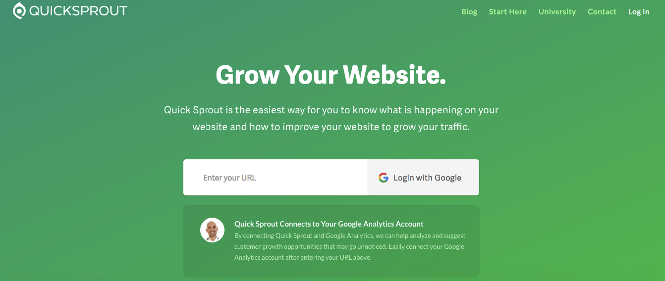
You’ll notice that I make it a point to minimize the number of options on all my sites, and it’s worked out beautifully.
7. Missing or hard to find contact info
I was honestly a little surprised when I came across the following stats regarding contact info from KoMarketing:
- “Once on a company’s homepage, 64 percent of visitors want to see the company’s contact information.”
- “44 percent of website visitors will leave a company’s website if there’s no contact information or phone number.”
- “51 percent of people think ‘thorough contact information’ is the most important element missing from many company websites.”
I knew that having some means of contact was important but not necessarily that critical.
But these stats show that your conversion rate will basically be cut in half if there’s no contact info or phone number.
So it’s super important to include this information in a conspicuous area.
8. Spelling/grammatical errors
I know we’re all human, and humans make mistakes.
But spelling/grammatical errors can be costly. Really costly.

One study in particular found that “59 percent of people would not use a company that had obvious grammatical or spelling mistakes on its website or marketing material.”
In other words, nearly six out of 10 would-be customers will abandon your site if they come across these types of errors.
This is why it’s so important to be hyper-diligent, and you may even want to use a free tool like Grammarly when writing copy, blog posts, or other content.
9. Stale content
Here’s one that might not be so obvious: having outdated content on your blog.
I instantly become skeptical of a company if its blog hasn’t been updated in at least six months.
I wonder if they even care.
If you run a blog, be sure to update it fairly frequently.
This doesn’t need to be every week, but it should be once a month at an absolute minimum.
10. Crazy salesy copy
Did you know that “approximately 96 percent of visitors that come to your website are not ready to buy?”
If you go right for the jugular and beat them over the head with “salesy copy,” many will run.
In other words, using too much hype or BS and sounding like a sleazy used car salesman is going to hurt your conversions.
Instead, most leads need to be warmed up before they’re ready to buy.
I suggest checking out this post from Kissmetrics for advice on writing persuasive copy without any “icky gimmicks” that could turn off your audience.
11. No social proof
Anyone can make claims on their website.
Today’s customers want to know you can walk the walk and not just talk the talk.
Social proof in the form of testimonials, positive press, and social shares can go a long way.
One of my favorites is media icons (otherwise known as logo porn), which showcases companies you’ve partnered with, written for, or done business with.

That can instantly quell any doubt that may have arisen in a visitor’s mind.
12. No trust elements
Trust elements include things such as:
- A badge from the Better Business Bureau
- Indication of secure payment processing
- Return and refund policies
- Detailed product information
- Unbiased reviews
If you’re missing these types of trust elements, it’s going to be difficult to get your leads over “the buying hump.”
I suggest reading this post from ConversionXL for a comprehensive list of ways to boost your website’s credibility.
13. Annoying sign-ups
You know what people really hate?
Those long-winded sign-up forms with fields that just seem to go on and on.
I’ve abandoned numerous sites when I got hit with these.
If you’re a first-time shopper, you don’t want to waste your time entering loads of info just to make a purchase.
Or as one disgruntled online shopper phrased it,
“I’m not here to enter into a relationship. I just want to buy something.”
The bottom line is to reduce the number of fields a person has to go through to make a purchase.
Or better yet, ditch it all together, and let someone check out as a guest.
Going this route can result in a surge in conversions. If you’ve never read The $300 Million Dollar Button, I greatly recommend it.
It touches on this topic and highlights a real-life case study.
14. An arduous checkout process
This roadblock piggybacks on the previous one.
Besides having too many forms to fill out, a complicated, exhausting checkout process can really hurt conversions.
Just look at the number of customers that drop off during checkout:
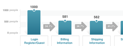
If you’re making people jump through too many hoops or have confusing ordering/shipping policies, it’s going to disrupt things.
A streamlined checkout process will be simple and linear and have a progress indicator so customers can see the steps they’ve completed and still need to complete.
This post from Kissmetrics highlights some common problem areas of the checkout process and explains how to correct them.
15. No A/B testing
Last but not least, there’s the issue of A/B testing.
It’s amazing that many websites still fail to use this simple yet incredibly powerful technique.
Running continuous tests on elements like CTA buttons, colors, and copy can have a major impact:
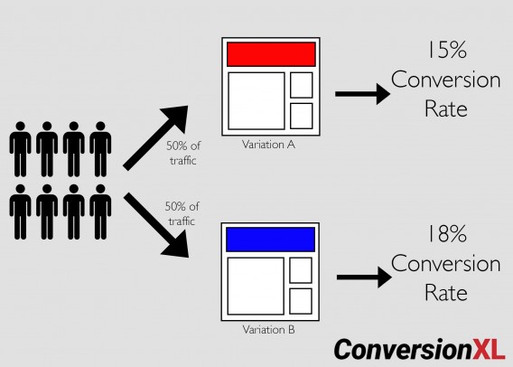
I really like this article from ConversionXL for learning both the basics and more advanced techniques of this A/B testing.
Conclusion
There is a lot happens between the time when a person lands on your site and when they actually complete a purchase.
And that’s why a lot can go wrong.
Understanding some of the most common roadblocks and diagnosing them can make the process go far smoother.
I’ve found the 15 issues in this post to be some of the most pervasive.
But making the necessary fixes can be your ticket to boosting conversions and getting the most out of your traffic.
What’s been your main conversion obstacle? How did you overcome it?
