First impressions matter.
When someone visits your website, the first thing they’ll see is your homepage. The way your homepage is set up can make or break your conversion rates.
I know how much time and effort it takes to improve your SEO ranking and drive more traffic to your website.
If you’re seeing a boost in your website traffic but not in conversions, it’s time for you to analyze your homepage. It doesn’t matter what type of business you have or what industry you’re in, focusing on the design of your homepage pays off.
Where do you start?
Your website has so much to offer. It can be overwhelming to decide what you want visitors to see first. It’s tempting to include as much information as possible.
I’ve helped tons of businesses revamp their websites. I’m going to share some of the top elements of a homepage you need to focus on.
If you follow these tips, your homepage will turn into a conversion machine. Here’s how you do it.
Keep it simple
Websites with simple designs have higher conversion rates.
As I briefly stated earlier, some websites try to cram as much information as possible into a small space on their homepages. They want to show off all their products, services, awards, affiliations, contact information, and anything else you can imagine.
If this sounds like your homepage, simplifying your design should be the first thing on your agenda.
It’s fine to include lots of information on your website, but it doesn’t need to be on your homepage. Take a look at this design from the Mint homepage.
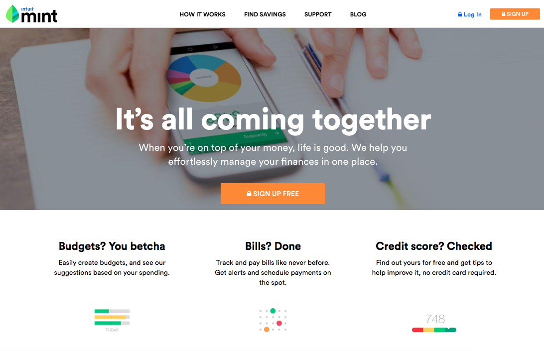
Do you see how effective this is?
The menu bar at the top of the screen has only four options. The amount of text is minimal, so it’s very easy for users to scan the page and focus on headlines.
There is a clear point of emphasis on the middle of the screen. It’s their call-to-action (CTA) button, encouraging visitors to sign up for free.
Even if you’ve never heard of this company, this design makes it obvious what help they can offer their customers:
- finances
- budgets
- credit score
- bills
- savings
These buzzwords are easy to read because the layout is so simple.
Now the visitor can navigate on the website to find more information about what they’re interested in. But if Mint tried to explain every detail of their services in this small space, people would get distracted and overwhelmed.
While this homepage has some color, it’s used sparingly and tastefully. The colors aren’t contrasting and don’t make it difficult to read anything on the page.
To keep your website simple, you need to choose the right color scheme. This will help improve your conversion rates.
Compare your existing homepage to the example above. Try to replicate it in terms of the amount of text, navigation options, and CTA.
Focus on speed
Speed has a huge impact on your conversion rates. If your website loads too slowly, it’ll kill your conversions.
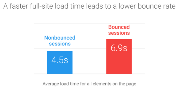
People are impatient. In today’s digital age, we’re used to getting content at lightning speeds. If a website doesn’t load right away, its bounce rate is likely to increase.
Your page loading time has a direct correlation with the previous point I talked about. Simple websites load faster.
If you’ve got tons of images, long blocks of text, complicated menus, lots of colors, flashing lights, and other unnecessary elements, your website won’t load very quickly.
But what if you’ve got a simple design and it still takes a while for your website to load?
I’d evaluate your web hosting services. While it may sound appealing to choose the cheapest option for hosting your website, you get what you pay for.
It’s worth it to spend the extra money to ensure your website doesn’t crash or have problems loading pages, especially the homepage.
The increase in website traffic and the boost in conversions will easily pay for the extra costs, plus extra in the long run.
Use quality images
Images can definitely help boost your conversion rates.
Websites without images seem plain, boring, and somewhat unprofessional. But that doesn’t mean you need to go crazy and put as many images as possible on your homepage.
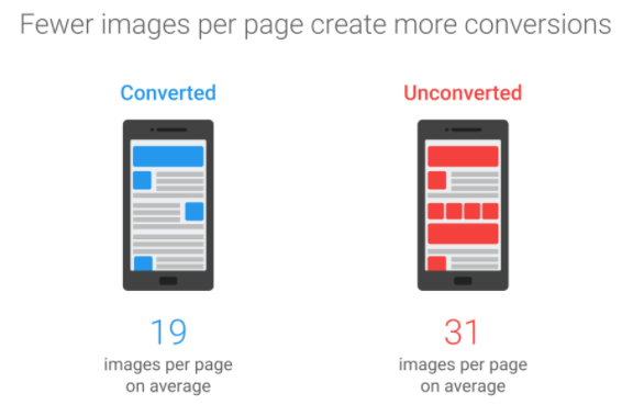
As you now know, too many images can hurt your page loading time. Furthermore, research from Google found pages with fewer images have higher conversion rates.
Use images sparingly. Make sure all your images look professional. If they look as if you took them on a flip phone in 2006, it won’t help your cause.
Don’t get me wrong, I’m not saying you shouldn’t use all the pictures you feel you need to on your website. I’m just saying you don’t need to have them all on your homepage.
For example, let’s say you have an ecommerce website.
You should have multiple-angle, high-quality images of every item you’re selling. You could have six, eight, or ten photos for just one item.
However, save those pictures for when a customer clicks on that product.
If you were highlighting your top five best-selling items on your homepage, you’d have 50 images if you used every single one. Instead, use one image per item. When a visitor clicks on one of them, they’ll see the remaining photos of that product on the corresponding page.
Run A/B tests
Let’s say you’ve made some changes to your homepage, and you’ve noticed your conversions have increased. That’s great news. Does that mean you’re done?
Absolutely not. While your conversions may have increased, you don’t know whether you’ve reached your peak yet. Keep striving to improve your website.
One of the best ways to figure out whether you’ve got the most optimal design for your homepage is through A/B testing.
Also known as split testing, A/B testing involves running alternative versions of the same page to see which one has a higher conversion rate: 50% of your traffic sees one design, while the other 50% sees another.
It’s important you don’t change too many elements between the two versions when you run these tests. Otherwise, you won’t know which factor impacted the results.
You’re better off changing one element only, such as the CTA button text, color, or placement.
Here’s an example of an A/B test from the Sim City homepage:
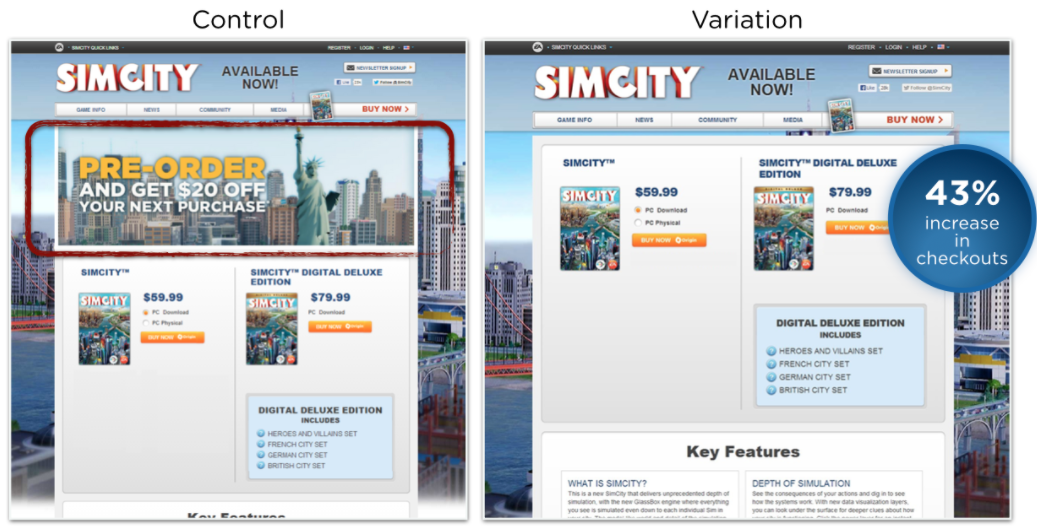
Look at the difference between the two variations. The homepage on the right eliminated some text and an image. As a result, the simplified version had a 43% increase in checkouts.
That’s because the control version had too many distractions. The variation was much simpler, so it was easier for the users to focus on checking out.
I see cases like this all the time in my consulting work. Businesses are typically convinced that an offer, such as the one above offering $20 off a purchase, will help drive sales and increase conversions.
But it isn’t until they run an A/B test that they discover what really works.
The possibilities are nearly endless when it comes to your A/B tests. After you test one element, change something else and run another test.
If you initially tested the phrasing of your CTA button, test the color next. After that, test its size or placement. You can even test various images to see which one converts better.
A/B testing is an ongoing process. The tests should go on for as long as they need to until you feel your results are accurate.
Don’t let these tests get in the way of making other improvements to your homepage, such as simplifying the design or increasing the page loading time.
Make sure your call to action is clear
I know I’ve mentioned your CTA a few times throughout this guide, but it’s so important that it’s worth discussing in greater detail.
You can’t expect to have high conversion rates if your CTA isn’t glaringly obvious on your homepage. Although it’s critically important, many websites neglect their CTAs:
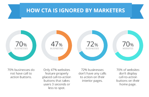
These numbers blow me away. Less than half of all the websites have a CTA that can be found in under three seconds.
People visiting your website won’t spend much time looking for the button that puts money in your pocket. If it’s not obvious, they’ll move on.
That’s why simplicity, which I talked about earlier, is so important. If you have few distractions on your website, the visitor’s eye will go straight toward your CTA.
Look again at the Mint website, or the Sim City’s A/B test. It’s very easy to find call-to-action buttons in both cases in just a couple of seconds.
Here’s a look at the homepage for one of my other companies, Crazy Egg:
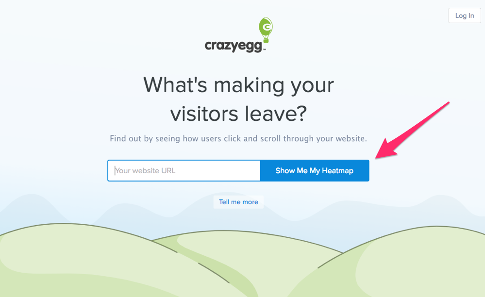
As you can see, I practice what I preach.
The design of this homepage is extremely simple, and the CTA can be spotted instantly.
Here’s something else you should keep in mind. Your homepage should have only one CTA. Yes, you’ll have links to other pages on your site.
But when it comes to getting conversions, the call-to-action button needs to be obvious:
- sign up today
- subscribe now
- join for free
- click to learn more
- shop now to get 20% off your purchase.
All of these are great CTAs for a homepage. However, these won’t be effective if they’re all used simultaneously.
The site visitors won’t know which one to click on, and it will hurt your conversions. Focus on the most profitable action.
Optimize your website for mobile devices
It’s awesome that your site works well on a desktop, but that’s not enough if you want the highest conversion rates possible. Your homepage needs to be optimized for smartphones and tablets.
Earlier I discussed the importance of speed. If your site takes too long to load, users will abandon the page.
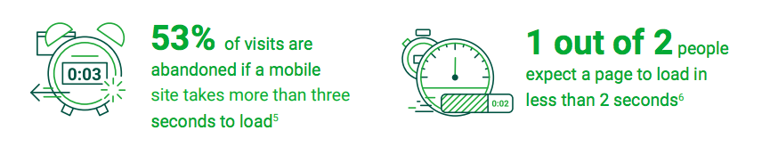
Obviously, this will crush your conversion rates. Half of Internet users expect your mobile website to load in less than two seconds.
Mobile optimization is important for all websites in every industry. However, it’s even more important for ecommerce stores.
That’s because the majority of online shoppers use their smartphones to shop.
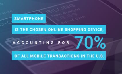
If you have an ecommerce store that’s not mobile optimized, you’re missing out on a huge portion of the market.
Optimizing your homepage for mobile users needs to be a priority.
Conclusion
If you’re unhappy with your conversion rates, analyze your homepage.
Start by simplifying the design. This will make it easier for visitors to find your CTA.
Simplicity also translates to a faster page loading time. Make sure you have suitable web hosting service.
Your homepage should have high quality images. Just be sure to use them sparingly. Too many images can have a negative impact on your conversions.
Run A/B tests to see which elements of your homepage can be modified to improve conversions.
Making sure your homepage and the rest of your website is optimized for mobile devices is an absolute necessity.
If you follow these tips, you’ll start to see your conversions rise almost instantaneously.
What elements of your website are designed to optimize conversion rates?