Facebook is closing in on nearly two billion monthly active users!
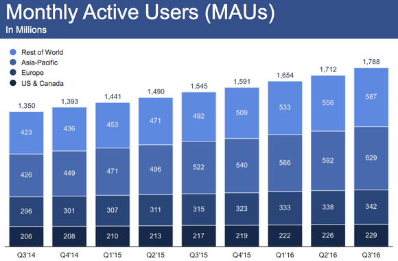
There was even an 18% increase from 2016.
If you think about the sheer size and scope of Facebook, it’s mind-boggling.
And when you consider the fact that one in five pageviews in the United States occurs on Facebook, the power of this social media behemoth is undeniable.
So, of course, you want to do everything within your power to connect with the largest possible percentage of your target demographic.
This enables you to build your following, generate more leads and rake in plenty of referral traffic to your website.
Of course, there are numerous variables that ultimately determine your success on Facebook.
But the way I look at it, your first order of business should be to make your Facebook page visually appealing to your target demographic.
It needs to pop.
In this post, I’m going to discuss the fundamentals of designing an eye-appealing Facebook page and cover some specific elements you should include to impress your specific audience.
Start with a customized cover photo
The most important element by far is your cover photo.
It takes up the most amount of real estate and is typically the first thing visitors see.
It needs to be perfect.
I recommend creating a customized cover photo that encapsulates your brand identity and instantly gives people a feel for what you’re all about.
Here’s the cover photo I use for the Quick Sprout Facebook page:

If you notice, it includes the same branding elements as QuickSprout.com, with the green background.
And in my opinion, this is the number one thing you should strive for.
You want your cover photo to mesh with your existing brand so that visitors can connect the dots.
This is key for strengthening your overall brand identity.
Here’s a screenshot of HubSpot’s Facebook page, meeting this requirement perfectly:

It utilizes their signature orange color and their distinctive logo.
And here’s another thing.
If it makes sense, try to incorporate your unique selling proposition, like I did with the Quick Sprout page.
Ahrefs pulls this off flawlessly with their cover photo:
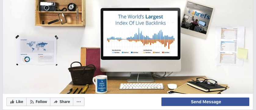
This is helpful for first-timers, who may not fully understand what product you’re offering.
I suggest staying away from mediocre-looking stock photos because they tend to come across as being inauthentic (and sometimes cheesy).
Fortunately, creating your own customized Facebook cover photo isn’t difficult to do.
If you’ve got even an ounce of “designing chops,” you can use a free tool like Canva to create a professional-looking image.
The last time I checked, cover photos display at 828 pixels wide by 315 pixels tall on computers and 640 pixels wide by 360 pixels tall on smartphones.
You’d want to stick with 828 x 315 pixels to ensure your image doesn’t pixelate.
Here’s how to do it on Canva.
First, sign up for Canva:
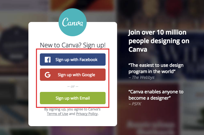
It only takes a minute.
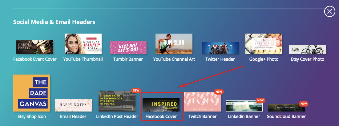
Once your account is set up, go to “More” from your dashboard.

Then scroll down to the “Social Media and Email Headers” section.
From there, you’ll see “Facebook Cover.”
Click on that.
Now, you can choose from Canva’s pre-made layouts, upload your own to edit or create one completely from scratch.
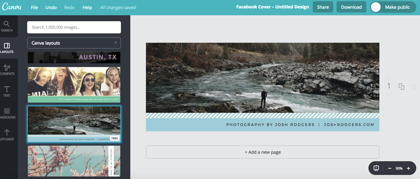
It’s quite easy.
You don’t even need to have any coding skills.
There’s no excuse to use some crappy stock photo when you can create your own epic Facebook cover photo free.
By the way, here are a few other ideas of the type of content you can feature in your cover photo besides just your brand name:
- a photo of your main product
- an event announcement
- a contest announcement
- a testimonial
- icons of companies you’ve worked with
Be creative, and try to stand out from the rest of your competitors.
Rock your profile picture
The next thing most of your visitors’ eyeballs will gravitate to is your profile picture.
Just like your cover photo, this too needs to be professional-looking and fully customized.
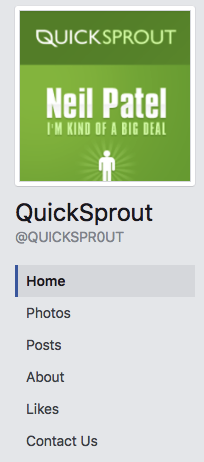
Here’s what the Quick Sprout profile picture looks like:
And here’s what I use for my Neil Patel Facebook page:
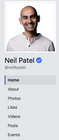
As you can see, they’re both in line with the branding I use on each site.
They’re also fairly simple.
I recommend you don’t get too busy or cute with your profile picture and keep it fairly sparse.
After all, you don’t have much space to work with.
In terms of ideal dimensions, Facebook suggests going with 170 x 170 for computers.

Again, you can use Canva if you need to create your profile picture from scratch or edit it.
The bottom line is you shouldn’t skimp on either your cover photo or profile picture.
These are the first things your visitors will see.
Not only should they look great, they should also tie in to your brand as well.
Post relevant photos
The first thing you’ll see when you scroll down most business pages is a “Photos” section.
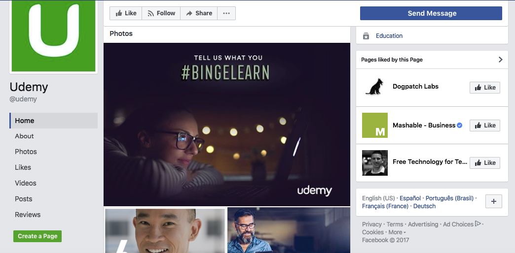
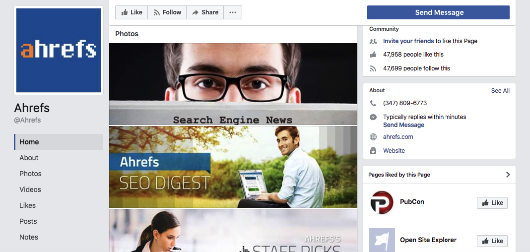
This is another chance to crank up the eye appeal of your Facebook page and make it even sexier.
It’s also another way to reinforce your branding.
Add a handful of high-quality images to populate this section of your Facebook page.
Keep in mind visitors will see only three photos on your timeline, so you don’t need to be over the top in terms of quantity.
In fact, there are only three photos on the Quick Sprout page, and it’s done just fine:
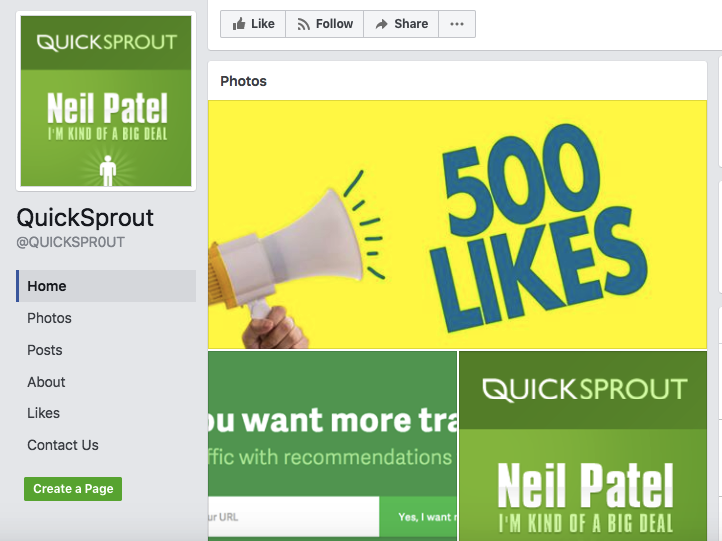
What is important is that they all look great and enhance the overall aesthetic of your Facebook page.
You can then organize them into relevant albums like profile pictures, cover photos, timeline photos, etc.
Just be sure the three images displayed on your timeline are all home runs.
Ideally, they’ll be branded, and you can save the other images for the various albums that visitors can find by clicking on “Photos.”
Consider adding videos
I probably don’t need to tell you how huge video is right now.
In fact, “79% of internet traffic will be video content by 2018.”
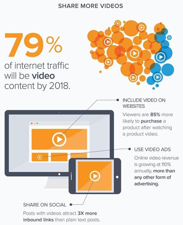
Therefore, I’m a big proponent of using video anywhere I can.
One technique I’ve had tremendous success with is incorporating video into my Neil Patel Facebook page.
If you scroll down past the photos section, this is the next thing you’ll see:
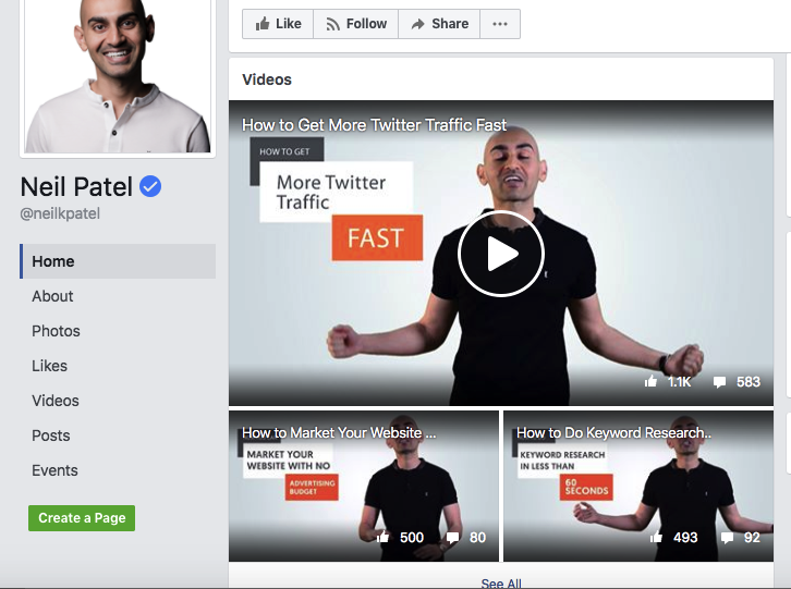
Using video accomplishes three important things:
- It allows you to quickly explain who you are and what your brand is all about.
- You can instantly build rapport with your audience and begin to gain their trust.
- It’s an easy way to bring additional exposure to your Facebook page (people can easily “Like” it and share it).
On top of this, it improves the overall aesthetic of your page.
As long as your videos look professional, they can boost the visual appeal considerably.
And I can pretty much guarantee people are going to take you more seriously.
Experiment with video.
More specifically, upload at least three videos to your Facebook page.
If you already have video content on your website or YouTube channel, this is incredibly easy.
Just upload the same content.
In fact, I use videos from the “Neil Knowledge” section of NeilPatel.com.
Otherwise, you can just record a few videos specifically for Facebook.
I’ve found this to be a great way to build trust and generate more leads.
It also helps beef up my Neil Patel Facebook page and makes it more robust.
Pin epic content to the top of your page
There’s one more feature I love.
And that’s the one that allows you to pin a top post to the top of your page to maximize its exposure.
Let’s be honest.
Some posts are better than others.
Although you always strive to maintain quality standards, some content naturally rises to the top.
Maybe it’s an epic, long-form post or an article that received a ridiculous amount of engagement.
Whatever the case may be, pinning it to the top can boost your authority and credibility.
Here’s what you do.
First, make sure the post has a brilliant-looking image.
If it’s only so-so, I suggest changing it to something that looks amazing.
Then, scroll down to the post, click on the arrow in the top right-hand corner and click on “Pin to Top.”
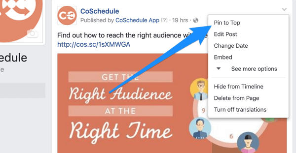
That’s all there is to it.
From now on, this is the first post that visitors will see when they browse through your content.
If you want to switch it for a different post later on, follow the same process.
Conclusion
As humans, we can’t escape our love of visuals.
Visual content is king because “90% of information transmitted to the brain is visual.”
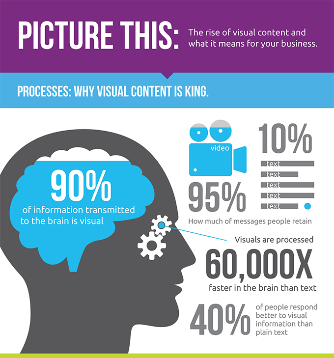
When it comes to your brand’s Facebook page, your main area of focus should be aesthetics.
By following these steps, you should be able to instantly grab the attention of visitors so that they explore more of your content.
And when it’s all said and done, this can have an extremely positive impact on your Facebook lead generation and increase your following.
Can you think of any other ways to make your Facebook page more visually appealing?
