The majority of people have the attention span shorter than a goldfish.
When it comes to your website, it’s probably hurting you.
According to HubSpot, “55% of visitors spend fewer than 15 seconds on your website.”
You’d better grab their attention in a hurry.
But how do you do that?
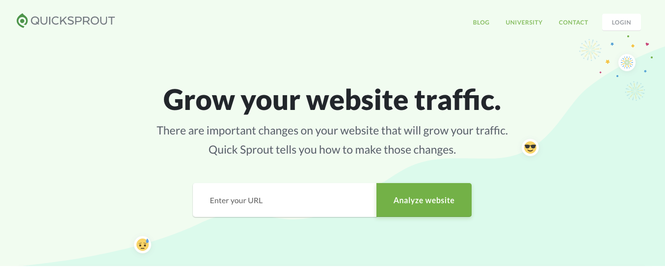
By placing the most important information above the fold.
It’s one of the most tried-and-true web design best practices.
And it’s one that has received a lot of debate.
I’ve heard some people say you need to follow the original formula religiously and keep key information above the fold.
I’ve also heard other people say that it doesn’t really matter because most people are willing to scroll.
And this makes more sense as of late, considering the number of people using mobile devices.
Everyone has their own opinion, and that’s okay.
But in this post, I’ll share my take on what needs to be above the fold on your homepage.
I’m going to cover the key elements and absolute essentials and condense them into a comprehensive list so you’ll know precisely what to include.
What exactly does “above the fold” mean?
Before I dive in, allow me to give you a formal definition of “above the fold” so that we’re on the same page.
According to Tech Target,
above the fold is the portion of a web page that is visible in a browser window when the page first loads.
In others words, it’s what visitors first see without scrolling.
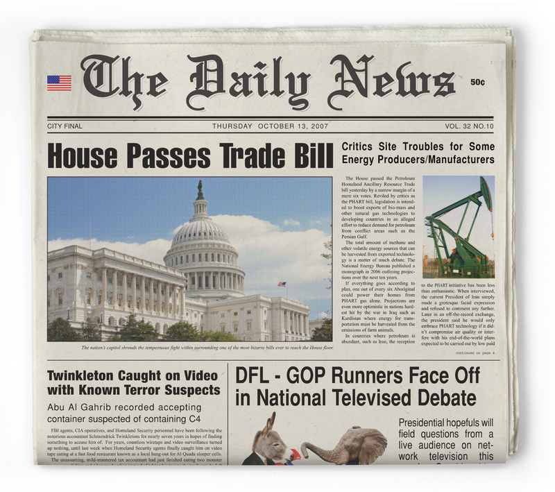
Although we usually think of websites when referencing “above the fold,” this term actually originated with traditional print publications.
It was simply the upper half of the front page of a newspaper where the top story was printed.
Like this:
Why is above the fold so important?
It’s simple.
- It’s what people see first.
- It’s what attracts the most attention.
- It’s where visitors spend the bulk of their time.
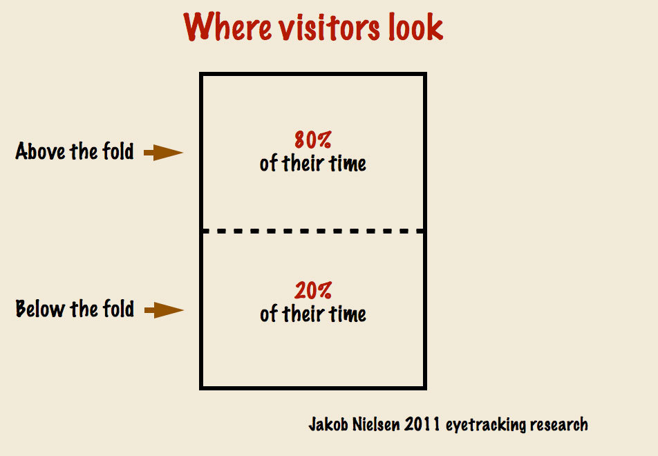
A 2011 eyetracking study from Jakob Nielsen found that visitors spend 80% of their time above the fold.
It’s easy to see why people make such a big fuss about deciding what to include above the fold.
While there will always be some debate as to how important placing content above the fold is, there’s no denying that it is important.
And the way I see it, there are a handful of vital elements that need to be included.
Unique selling proposition (USP)
Here’s a screenshot of the definition of a USP from Tech Target:

It’s absolutely essential that you include this above the fold.
Your USP is the way visitors get their bearings after landing on your site.
It’s your way of instantly showing them what you’re offering and how they’ll benefit by exploring your website further.
Here’s the USP for Quick Sprout:
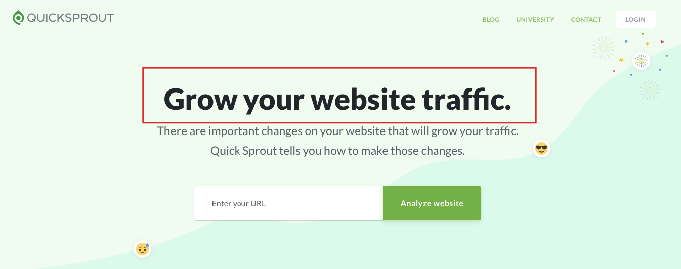
Bam! Visitors instantly know what’s up.
It doesn’t matter what industry you’re part of or what niche you specialize in, a clear, well-crafted USP is a vital element of your above-the-fold content.
Some “explainer” copy
So, your USP provides visitors with an initial orientation.
But it doesn’t usually explain all the details.
This is why you need to include a bit of “explainer” copy that tells first-timers what your product does.
Here’s a great example from the Ahrefs homepage:
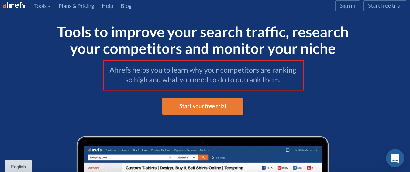
It’s brief and concise, but visitors can quickly tell what they can accomplish by using Ahrefs.
In this case, they can learn what’s helping competitors rank high and what steps they can take to outrank them.
Notice that it doesn’t drone on paragraph after paragraph with long-winded copy.
It matter-of-factly elaborates upon the USP and explains what the product does.
In turn, this should raise the interest level of visitors and encourage them to keep exploring the website further.
Your brand logo
This is a biggie.
In a world with super-saturated industries, where companies often have to scratch and claw their way to the top, brand recognition is of the utmost importance.
That’s why you want to establish consistent branding across the board and take every opportunity to reinforce your brand identity.
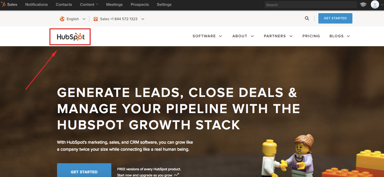
Take a look at the homepage of any major company, and I can pretty much guarantee they’ve included their brand logo above the fold.
Below are just a couple of examples.
Here’s HubSpot’s homepage:
And here’s Dropbox’s homepage:
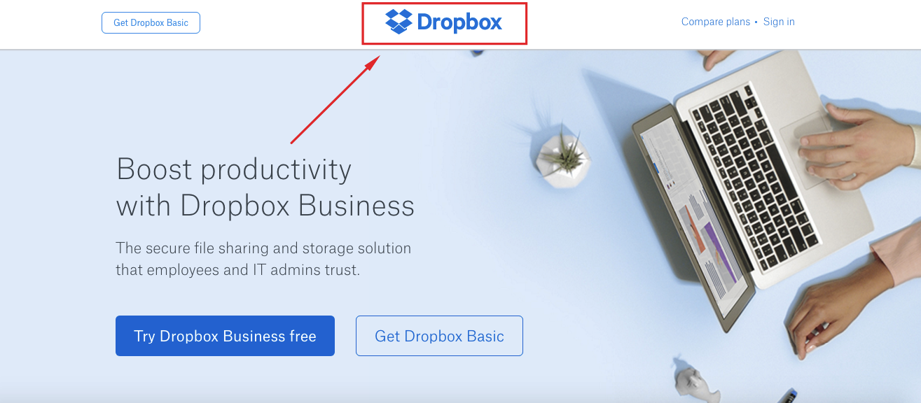
It’s your way of letting visitors know who you are, and it plays a role in your long-term brand building.
Simple navigation
Let’s say a visitor has just landed on your homepage for the first time.
After seeing your USP and explainer copy, they have a pretty good idea of what you’re offering.
And after seeing your brand logo, they associate it with you.
At this point, you’ve piqued their interest, and they want to learn more.
It’s your responsibility to provide them with the framework to explore your site in a streamlined, systematic fashion.
This, of course, is done through simple, intuitive navigation.
Allow me to provide you with a few examples of brands that do this really well.
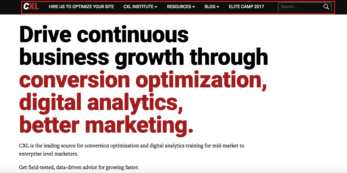
First, there’s ConversionXL:
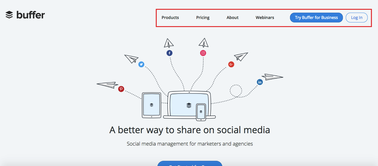
Next, there’s Buffer:
Finally, there’s Pat Flynn’s Smart Passive Income:
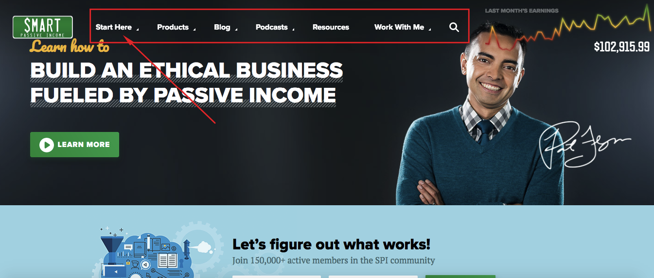
Pat’s homepage incorporates a feature that I’m a big fan of.
The “Start Here” page.
It’s not necessary for every website, but it’s a great way for some sites to give first-timers a quick and easy way to get acquainted with the site, providing them with the best content to accomplish that.
Notice that all three of these examples feature simple, easy-to-spot navigation.
This way visitors can quickly find what they’re looking for with minimal effort.
This is crucial for encouraging visitors to browse your site in-depth and for getting conversions.
Contact info
This element is more important than you may think.
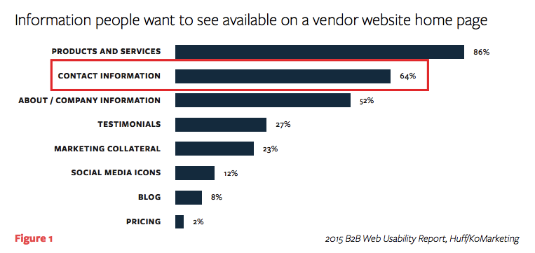
According to a web usability report from KoMarketing,
51% of people think ‘thorough contact information’ is the most important element missing from many company websites.
On top of this,
64% of people want to see contact information on a vendor website homepage.
It’s especially important if you’re running an e-commerce store, selling online.
People want to be sure you’re a legitimate business and not a scam artist who’s going to take their money and run.
Having full contact information tends to put your visitors’ minds at ease once they land on your homepage.
Your CTA (sometimes)
The fact that I put the word sometimes in brackets may have made you raise an eyebrow.
I mean, why would you not include a CTA above the fold?
This is the absolute basics of homepage design, right?
But here’s the deal with CTAs.
Several studies have been done to determine the impact of CTAs placed above the fold versus below the fold.
One of the more interesting studies involved The Boston Globe.
The experiment was simple.
They ran an A/B test where the CTA was first placed above the fold on the homepage and then below the fold.
Here’s what the first homepage looked like with the CTA above the fold:
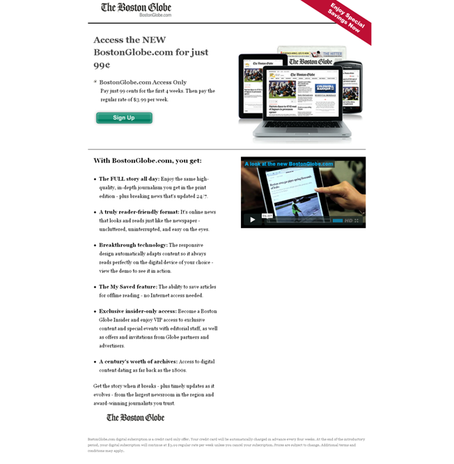
And here’s the second version, where the CTA was below the fold:
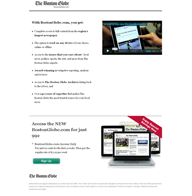
Conventional logic would suggest that the first version with the CTA above the fold would outperform the second version, right?
Not exactly.
In fact, the results were virtually the same, and there were no significant differences in conversions.
This tells us that maximizing conversions isn’t about simply placing your CTA above the fold.
Anyone can do that.
It’s more about nailing it with all the other elements and writing great copy.
If you pique the interest of visitors, many will make their way further down your homepage and ultimately stumble upon your CTA.
That being said, I generally recommend placing your CTA above the fold as long as it makes sense and flows with the rest of your content.
This tends to be the approach of most successful brands.
However, you never want to force it.
Your main priority is to motivate visitors and to write compelling copy.
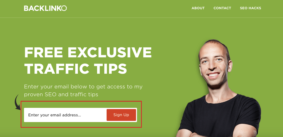
Also, be sure you’re not overwhelming visitors by stuffing the page wtih several CTAs above the fold, e.g., signup forms, a link to your product, etc.
Instead, keep it simple, and focus on a single CTA.
Like this:
Conclusion
The formula for what to include above the fold on your homepage is pretty straightforward.
Here’s a recap:
- A well-written USP
- Some brief explainer copy
- Your branded logo
- Simple, intuitive navigation
- Contact info – especially important if you’re running an e-commerce store
The CTA is optional and doesn’t typically affect conversion rates as much as you may think.
But if you can incorporate it in a seamless, non-disruptive way, by all means, include your CTA above the fold.
While there are other elements you could include, these are the essentials.
By putting them all together, you should be able to entice a sizable portion of your readers to continue browsing and even go through your sales funnel.
What do you think the most important element to include above the fold on your homepage is?
