There are so many components to a killer website design. But all too often I see people overlook minor details, like typography.
I know what some of you might be thinking. How important can a website’s font really be?
Believe it or not, something as simple as choosing the right font can have a major impact on conversion. Plus, website fonts affect the overall appearance of your site.
Now it’s unlikely that you’ve been on a website and thought, “Wow! I absolutely love this font!”
This just isn’t something that our minds are trained to look for and I’m not expecting you to find a font that’s going to “wow” your website visitors. But, I can guarantee that you’ve been on websites that have fonts that were generic, unappealing, difficult to read, or felt out of place. You obviously don’t want people to have that impression of your website.
Why your website font matters
Here’s something to consider: different website fonts can change the reader’s perception of a particular topic.
Errol Morris conducted a survey in an article published in The New York Times in 2012. He included a passage from a book that claimed we live in an ear of unprecedented safety, and followed the passage up with two questions:
- Is the claim true? (yes or no)
- How confident are you with the answer? (slightly, moderately, very)
As it turns out, Morris didn’t care about anyone’s opinion. He just wanted to know if the font could influence their answers. Forty thousand people unknowingly participated in this experiment. While everyone read the same passage; they did not all see it in the same typography.
Check out these results.
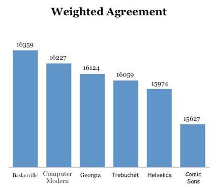
This graph shows all of the respondents who agreed to the first question. Morris took their levels of confidence in the second question and assigned a weighted value to each response.
In doing so, it’s clear that there was a difference between how confident people were in agreeing with the claims being made based on the font they were presented in. Now let’s look and see the results of respondents who disagreed with the passage.
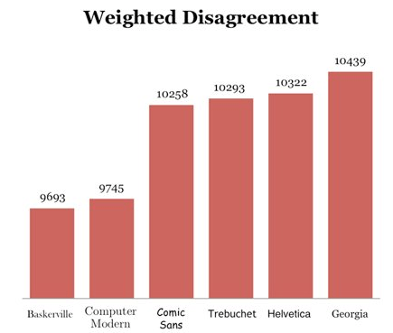
Compare the two graphs. Do you notice any similarities?
As you can see, the Baskerville font was ranked highest for weighted agreement and lowest for weighted disagreement. Comic Sans font ranked lowest for weighted agreement, and ranked high for weighted disagreement.
Based on this data, Morris was able to conclude that fonts can influence the way people perceive information. Basically, the typeface can actually affect the credibility of your website.
In short — yes, website fonts matter.
The best Google Font pairings for 2019
You don’t want to have the same font everywhere on your site; that’s too boring. Mix it up! But make sure you pick fonts that go well together. I created this guide to help you do just that.
There are plenty of platforms for finding free fonts, but Google Fonts is my favorite. I identified the top Google Fonts pairings for 2019. So check out my list, and pick out a combination that works best for your website.
Open Sans and Roboto
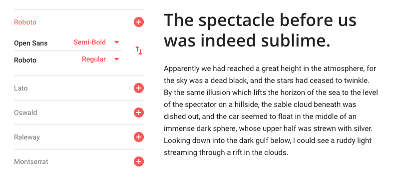
The header of this screenshot is Open Sans semi-bold. The paragraph below it is Roboto regular. I think the semi-bold header just ads a bit more punch than the regular weight of Open Sans, but it’s fine if you go with that option as well.
The reason why these fonts work so well together is because they are both crisp and extremely legible.
You’ve got lots of different options here to consider for your website design. This combination could be used to convey the value proposition on your homepage. Use the Open Sans header as a point of emphasis, and then elaborate on the subject using Roboto.
These fonts work well together if you swap them as well. You could use Roboto as the header, and Open Sans for the paragraph. In this case, I’d recommend going with Roboto medium, and Open Sans regular.
Playfair Display and Montserrat
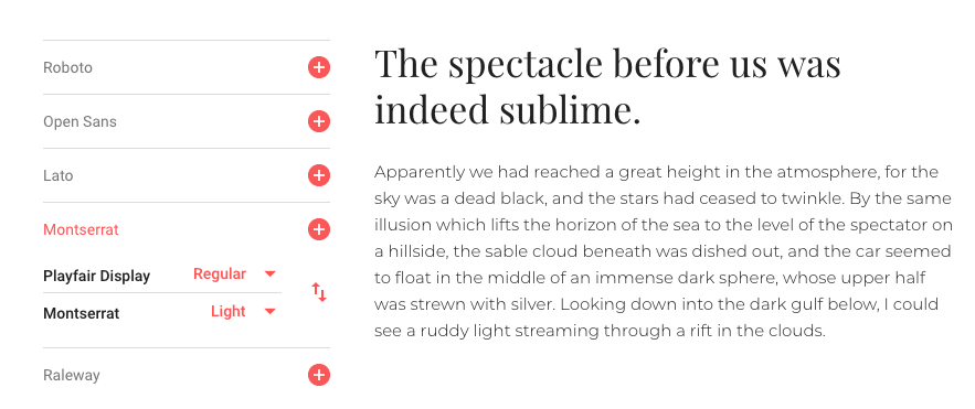
This font combination works best for shorter text on your website. I wouldn’t necessarily use it on a blog post or something like that.
However, this pairing is perfect for a product title and product description, especially for ecommerce shops in the fashion industry. The lighter weight font, like Montserrat light, gives the text a certain level of elegance that fits with a luxury brand persona.
Interestingly enough, if you swap the two and use Montserrat as the header, the persona changes to something that feels futuristic or techy. That combination can work well for some of you who are promoting a game, or even on a landing page to download your mobile gaming app.
Either way, these two fonts work well together. It depends on the theme and overall message that you’re going for on your website.
Lora and Alegreya
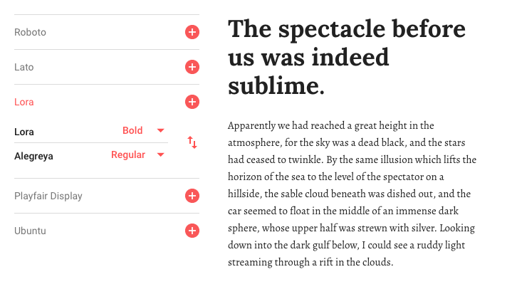
Lora bold is strong and legible, which is why it’s perfect for title pages. While the typography is powerful, it’s still friendly and inviting.
Alegreya regular compliments Lora really well, especially when used for captioning images.
While Alegreya is definitely legible, it can be challenging to read for long stretches, which is why it’s better for short text like captions or quick descriptions. I would not recommend experimenting with any other variations of Alegreya. Adding weight or italics to this font loses the legibility.
Now if you swap their positions, Alegreya bold works fine for title and header text. Lora regular is legible, so you could consider using it for longer text. I think this combination would be perfect for something like a customer testimonial or short case study.
Merriweather and Lato
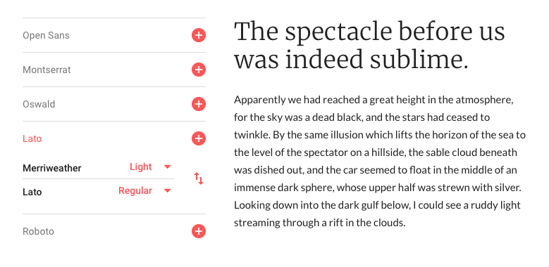
Merriweather light and Lato regular is a very clean and professional combination.
It’s a popular choice because the options are so versatile. Merriweather light is modern, tasteful, and appealing. When it’s followed up with text written in Lato, the pairing feels trustworthy.
I’d recommend using this combination on your homepage. For those of you who have a design that involves scrolling to learn more information, this text combination will work perfectly. I’m picturing a website visitor scrolling down your home screen, seeing an image on the left side of the page and this font combination on the right. When they continue scrolling, the next image will be on the right, and the text will be on the left.
If this sounds like your current design, definitely consider using this combination to add a touch of professionalism to your content.
Amatic SC and Josefin Slab
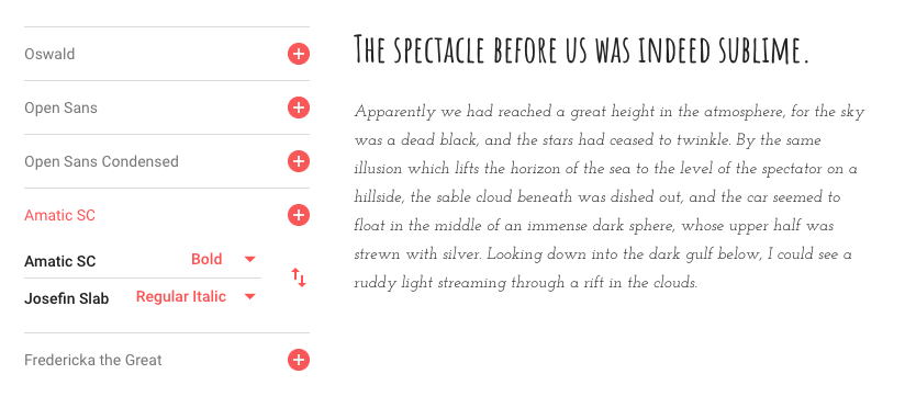
The font combination of Amatic SC bold and Josefin Slab italic is definitely not for everyone. I can’t say that I would recommend it to the majority of websites, but it’s an ideal combination for artsy websites. If you’re a musician, painter, or photographer, these fonts can be used sparingly on your pages.
The key here is to make sure that the text has plenty of space to breathe. I’d recommend using it against white or very light backgrounds. So check out my post on the top trending website color schemes of 2019 as well.
If you sell ceramics or sculptures, this font can be very appealing to your audience and fit nicely with the overall theme of your business.
Just make sure you don’t go overboard. Using too much of this on the screen is unappealing and challenging to read. So pick something else for longer blocks of text, such as your biography or about me pages.
Cinzel and Raleway
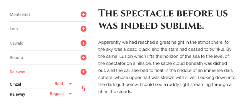
Cinzel is a bold font (no pun intended). It’s all capital letters, which makes it more suitable for short text as opposed to long blog posts or things of that nature.
It’s complemented really by a font that’s a bit more traditional, like Raleway. These two fonts are perfect for websites in the food and drink industry.
You could consider using this to spice up your online menu. Have the menu categories in Cinzel black, the meal titles in Cinzel bold, and the description of the item written in Raleway regular.
If you really want to be unique, you can swap the two and use Raleway for headings and Cinzel for the body text. This could work well for local coffee shops that update their website with daily specials or weekly brews.
PT Sans Narrow and PT Sans
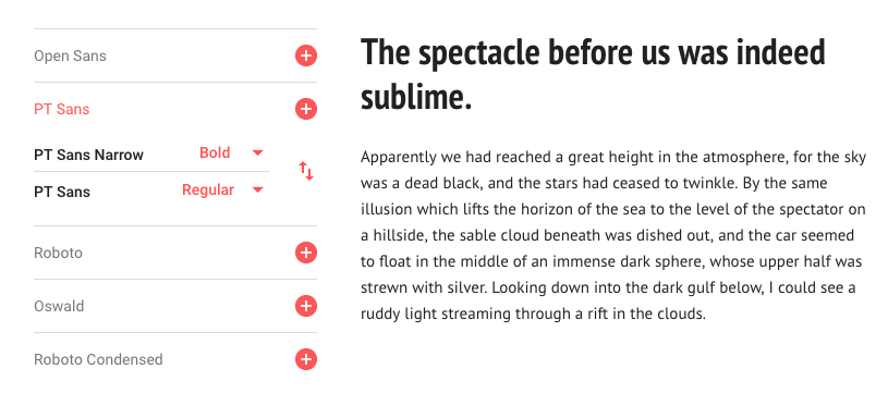
PT Sans Narrow and PT Sans is a classic combination. This versatile choice will work well for nearly any website in 2019.
Since both fonts are so legible, you can use it for text in short-form, as well as long-form content such as blog posts.
I like these fonts because they are easy to read, but not too generic and boring. PT Sans Narrow and PT Sans are inviting, so consider using them on home screens and landing pages.
How to pick the best website fonts
Now that you’ve seen some of the best Google Fonts combinations of 2019, how can you decide which one is best for your website?
The first thing you need to do is determine what type of content the font will be used for. Decide if the fonts are for your blog, homepage, landing page, product description, or navigation menu.
You’ll also want to consider the type of business you have, as well as the audience you’re targeting. Does the font need to be professional? Or do you have some room to be a bit unique?
The key to pairing two fonts together is contrast. The fonts should be different enough that each is distinguishable, but not so different that the reader is distracted.
You may want to use a few font combinations on your website, but don’t go overboard. Keep it simple. Each page should just have two fonts; three at most. If you want to use more, consider using variations of the fonts already on the page (light, italic, medium, bold, etc.) instead.
Conclusion
Fonts are important, so it time to get rid of the default. Google Fonts is one of the best resources for free website fonts. The platform has some of the top site fonts that go together.
- Open Sans and Roboto
- Playfair Display and Montserrat
- Lora and Alegreya
- Merriweather and Lato
- Amatic SC and Josefin Slab
- Cinzel and Raleway
- PT Sans Narrow and PT Sans
I tried to provide a little bit of something for everyone. Keep in mind, not all of these fonts will work for every website. So go through these and see which fonts fit best for your business, industry, audience, and theme.
Which website font pairings are you using in 2019?
