Our favorite website builder for making your site better for mobile users is Shopify, which offers impressive versatility for building your site. Try using Shopify with a free trial period or get a discounted rate for your first three months.
Delivering a great experience to both mobile users and desktop computer users who visit your website is a smart way to improve customer loyalty. Although many websites build their design around computer users, creating a mobile-friendly website is an important consideration, too.
Fortunately, you don’t have to redesign your entire website to achieve the look you want for mobile users. Follow our steps to make changes to your website that serve mobile users better while maintaining appealing design elements for desktop computer users.

The 7 Best Website Builders for Making Websites Mobile Friendly
Designing a website that’s both mobile-friendly and good for those using a traditional web browser on a computer is easier when working with a high-quality website builder. These best website builders walk you through the process of creating a great website for both smartphone and computer users.
- Shopify – Best for selling products and services
- Wix – Best website builder for your first website
- Zyro – Best for keeping website costs low
- Bluehost – Best for WordPress websites
- Squarespace – Best website builder for creators of all stripes
- Weebly – Best for solopreneurs
- GoDaddy – Best for building your website from your phone
Make Websites Mobile Friendly in 6 Easy Steps
Whether you are building a website from scratch or looking to edit a current website, it pays to focus on making it as mobile-friendly as possible. Use these steps to improve the look of your site on a mobile device, and you could see an improvement in your search engine rankings and visitor engagement.
- Assess Your Website
- Consider a Template or Theme Change
- Adjust the Website’s Loading Time on Mobile Devices
- Consider Using Responsive Design
- Make It Easy for Visitors to Interact With the Website
- Keep It Simple
The Shopify website builder can help you create ecommerce stores that provide a great experience for smartphone and tablet users. Sign up for Shopify’s free trial period to learn more about how the builder works.
Step 1: Assess Your Website
If you already have a website up and running, assess your site’s performance on mobile devices. If you do not have a website yet, you can skip this step and focus on creating a site with mobile-friendly features at the outset.
Access your website on a smartphone and tablet, and write down your thoughts as you use the site. Take note of things that are difficult to do on the smartphone or images/graphics that take a long time to load. Look at how the menu options appear on mobile and how easy it is to navigate the site. Also, take note of things that work well on the smartphone so that you don’t change things that are already working.
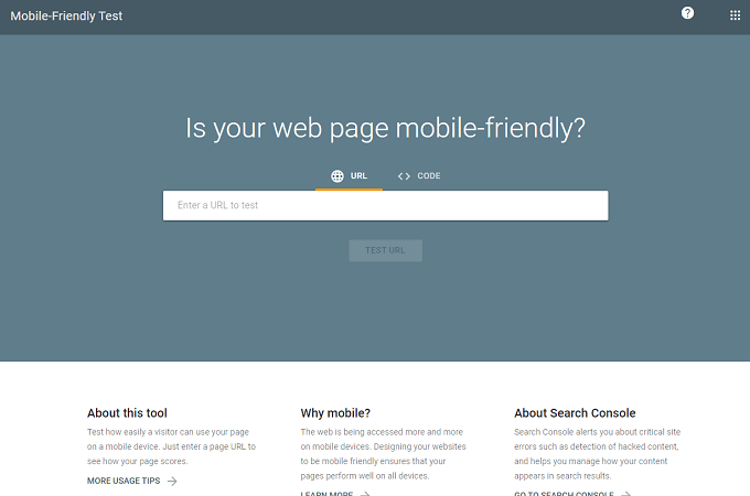
A tool that can help is the Google Mobile Test website. Enter your site’s URL in the text box, and the Google test will give you a rating for how your website performs on smartphones.
Don’t be discouraged if your site performs poorly on mobile devices. It is fixable! And sometimes, small changes that only take a few minutes can provide significant benefits for your mobile visitors.
It’s also possible that your website already has quite a few design elements optimized for mobile users. You may only need to use a few of the following steps to perfect your site.
Step 2: Consider a Template or Theme Change

If you built your website several years ago through a website builder, the site might not be very mobile-friendly. The builder’s older templates and themes for creating websites likely didn’t emphasize the experience for mobile users.
That’s no longer the case. Any website-building theme or template used in the past couple of years almost certainly has features aimed at optimizing the mobile user experience. With Shopify, for example, newer themes emphasize features like:
- Using graphics and photos optimized for mobile devices
- Simplifying site navigation for mobile devices
- Loading images and product pages quickly
- Avoiding popups that could block information on the smaller mobile screen
- Streamlining the checkout process on the mobile device
Before going through your website and changing it item by item to create a great design for mobile users, consider updating the theme or template. You can do this easily without affecting the information on your website, depending on the website builder you are using.
With Shopify, you can update your digital store’s theme relatively easily. Start by making a backup copy of your current theme. Then search for any updates to your current theme that are available. Such updates likely will have more mobile-friendly elements than the original theme.
Test the updated theme with your shop’s information to ensure everything loads correctly. If you like how it looks on mobile devices and in a web browser, you can publish it with the updated version.
You can also change to a completely new theme rather than updating your current one. Shopify has a theme preview feature that you can use to see how your site’s information looks in the new theme.
After updating or changing the theme, reassess your website with the new theme, as described in the first step. Check its performance with mobile devices to determine whether it needs further tweaking.
If you are creating a new ecommerce store website from scratch with a website builder from our list, almost any theme you pick should deliver some mobile-friendly results.
Step 3: Adjust the Website’s Loading Time on Mobile Devices
One of the most effective ways to improve your website’s performance on mobile devices is to reduce the time it needs to load. People visiting your website using a web browser on a computer or a mobile device do not like to wait for a slow-loading website.
If your site doesn’t have features aimed at helping it load efficiently on a mobile device, the lag during loading may cause the user to give up and try another site.
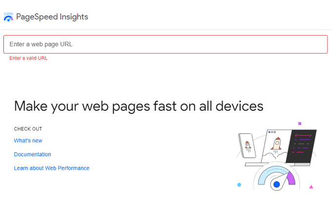
Start by testing the loading speed for your site on mobile devices. You can test this on your smartphone with a stopwatch or the Google PageSpeed Insights Tool. This tool measures your website’s performance for mobile and desktop computer users.
To improve performance, optimize the images you use. You want to use files with a small storage size or compress them before uploading to speed up the loading time. Don’t shrink photos and images to the point that the smartphone user can’t see them. Try to find the sweet spot in loading time and image quality.
Always try to use the JPEG format for images, as it limits file sizes more efficiently than other formats. Another option to reduce file sizes is to compress the image. If you use Shopify as your website builder, it has apps to optimize and compress your images.
Articles consisting mainly of text often appear on interior pages of the website. They usually don’t take long to load, so you may want to focus most of your efforts on the website’s homepage. This is probably where you have the most images, so it needs the most attention initially.
Step 4: Consider Using Responsive Design

If you use a website builder to create your site, consider deploying a responsive design. This design format creates a versatile website that should look great on any device and in any web browser.
With responsive design, the web page automatically adjusts itself to fit the screen of the visitor’s device. This is an important consideration because people use different screen sizes. Additionally, smartphone users might turn the phone sideways, so you may need to change how the web page loads compared to an upright phone screen.
Responsive design uses grids similar to many web page designs use. However, the grids in the responsive design can change their orientation and size based on the visitor’s screen.
You may be able to set maximum and minimum sizes and widths for images when using responsive design based on the screen size available.
One of the biggest advantages of responsive design for website designers is that it saves time. You don’t have to try to anticipate every size screen your visitors will use and then create code for all of them. You can use less code with responsive design because the code can adjust itself to match the screen.
Step 5: Make It Easy for Visitors to Interact With the Website
When viewing your website on a smartphone or tablet, users won’t have a mouse to click to make selections. The mouse can be extremely accurate when moving the cursor into place to click on a small button or link on a web page.
However, when working on a mobile screen, the visitor’s index finger takes the place of the cursor. Although you can be very accurate when tapping the screen with your finger, a fingertip’s average width equals about 50 pixels on a smartphone screen.
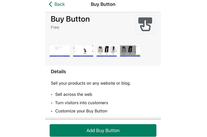
Make your buttons large enough that visitors can tap them accurately on the mobile device’s screen. If the button is too small for your visitors, they may make an error when tapping a button or link, which will frustrate them. If you run an online store, you especially want your Buy buttons to be easily large enough to tap accurately.
Additionally, you will want to use larger font sizes for a website being viewed on a mobile device. Visitors may become frustrated if they drag the screen to increase the text size to make it readable, as magnifying the screen makes it more difficult to navigate the page.
Simple, clean fonts at 14 or 16 points are usually the best for viewing on a mobile device.
Step 6: Keep It Simple

Perhaps the best piece of advice is to keep things simple. Yes, complex designs that look great in a web browser on a computer screen can impress visitors. But complex designs that slow loading time or look odd on a smartphone screen may alienate other visitors. Here are some ways to keep the design simple.
Smaller images: When you want your website to impress visitors using mobile devices, complex artwork and large graphics are useless. A design with the most important information easily visible at the top of the screen and not crowded out by a large image helps visitors.
Simple menus: Avoid using large collections of menus that take up a lot of screen space on a smartphone. Consider hiding the menus behind a button, so visitors can access them when they want to while leaving more screen space for other information.
Don’t use flash: Avoid using flash on the website, as it slows down the loading time on all devices. Additionally, smartphones and tablets running iOS or Android do not support flash. Consequently, your mobile users will not see the flash-based animation as you intended, so it doesn’t benefit them.
Keep forms short: When tapping on the smartphone’s virtual keyboard to enter information into a text form, it can be easy to hit the wrong key, leading to frustration. Don’t make your mobile visitors fill out much information through forms. Keep the form simple and get the basic information you need. If desired, request more information in a follow-up email or call.
Turn off autocorrect: It may annoy users if you leave autocorrect enabled for your forms. Autocorrect may cause more errors than it fixes when visitors are trying to enter their name or email address on a smartphone screen. It’s usually better to simply turn it off and let visitors enter the information on their own.
Make phone numbers tappable: If you want your mobile visitors to be able to call you easily, make the phone number on the website tappable. When the visitor taps the phone number, use code that lets a smartphone to automatically dial your number.
Final Thoughts About Making Websites Mobile Friendly
Adding elements that make your website more pleasing for mobile users to visit is not a difficult process. However, it does require some time to look closely at your website’s current design to figure out where you can make adjustments.
Ideally, editing your website to improve performance for mobile users should not affect how the site performs for computer users. When you take the steps listed here, you can find the right balance between appealing to both smartphone and computer users.
