
You’ve done a great job of finding new ways to drive more traffic to your website. But if that traffic isn’t translating into conversions, you’ve still got plenty of work to do.
I see this common misconception in my consulting work all the time.
Businesses spend much time and effort trying to improve their organic SEO while simultaneously running PPC campaigns to get more website visitors.
There’s nothing wrong with this strategy, but increasing site traffic isn’t the only metric that matters. You also need to focus on how visitors behave after landing on your pages.
Are they converting?
If not, that traffic isn’t translating to dollars. That’s why you need to learn how to use continuous A/B testing to increase conversions.
These experiments will help give you a better understanding of how to optimize certain design elements of your website. Subtle changes can make a major impact on getting your traffic to convert.
To those of you who have never run these tests before, I recommend reviewing my guide on everything you need to know before you start A/B testing.
However, if you already know how to run A/B tests but just don’t know what you should be testing, this list is perfect for you.
In reality, the number of things you could test on your website is seemingly endless.
That said, I narrowed down the top 13 elements you should start with. You can continue to tweak these and run several tests for each component on this list.
I’ll even give you some examples and real-life data to explain how other websites improved conversions by testing specific elements.
1. CTA size
As you read through this guide, you’ll notice that CTA buttons will appear several times in the discussion. This makes sense since it’s the most important feature in terms of driving conversions.
Start off with the size of your CTA button.
For the most part, this button needs to be big and bold. That way, it’s obvious and jumps off the screen. The last thing you want is for someone to be unable to find your CTA button.
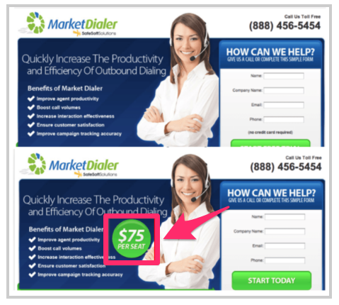
How big should it be for optimal conversions? The only way to know is by experimenting with different sizes. Here’s an example to show you what I mean:
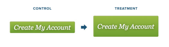
As you can see, these two CTA buttons are identical. They have the same font, color, and placement on the page.
The only difference is the size.
But bigger isn’t always better. In fact, after running this experiment, it was found that the larger CTA actually had 10% fewer conversions.
There could be a number of different reasons for this, but we don’t need to get into that right now. The important thing is that this would have never been discovered without running the A/B test.
Don’t assume that your giant CTA button is ideal for conversions. Test the size so you can be sure.
2. Headline wording
Your landing pages will have different headlines. These headlines will tell your visitors exactly what they’ll find on the page.
Depending on your goals, the wording can also prompt people to take a certain action.
Plus, you want your headlines to be SEO-friendly as well. Obviously, lots of thought should go into crafting these words.
That’s why you need to learn how to increase clicks by mastering your headlines.
To do this effectively, you’ll need to run A/B tests to find out which phrasing yields the highest conversion rates. Check out this example from the Movexa website:
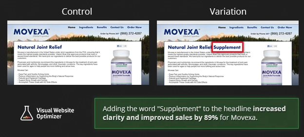
At first glance, the two pages look the same.
The only difference between the control and variation is the headline. As you can see, the difference is minor. All they did was add one word.
Movexa increased sales by 89% after adding the word “supplement” to the headline on this landing page.
So don’t assume your headline is perfect until you test different variations. You may be surprised with the results.
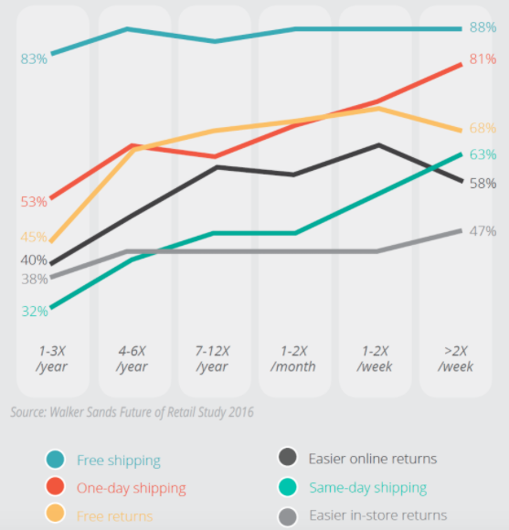
3. Free shipping information
This one is more specific to ecommerce sites. But it’s an important feature that shouldn’t be overlooked.
First of all, you shouldn’t be charging your customers for shipping.
If this expense is coming out of your pocket, just include it in the base cost of each item as opposed to charging separately for it.
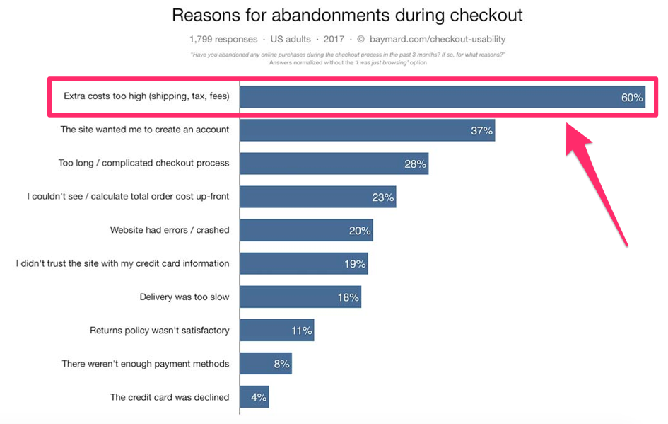
This added charge is the top reason for shopping cart abandonment.
But simply not charging for shipping isn’t enough. You need to display this information proudly on your website.
This way your customers won’t have to get to the checkout page to know that shipping is free.
But where do you tell them? That’s for you to find out through A/B testing.
Try different locations on the banner of your website. Maybe include it in the headline.
After you experiment with the placement, you can continue to run tests on the size, font, and color of this text as well. Try using all capital letters, or add an exclamation point to see if these variations change your results.
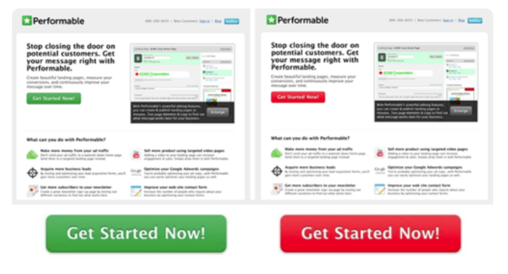
4. CTA phrasing
Let’s get back to discussing the CTA button.
Now that you know the optimal size of this button from a test I talked about earlier, you can start to experiment with the phrasing.
Obviously, the phrasing will depend on your goal. For example, a “buy now” CTA won’t make sense if you’re trying to get website visitors to subscribe to your email list.
Here’s an example from a landing page that targets visitors who need a loan:
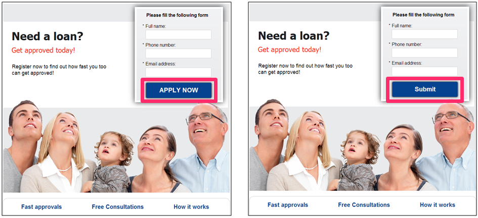
The team tested “apply now” against “submit.” Everything else about the pages was exactly the same.
The hypothesis here was that the word “apply” implied that the visitor could be rejected from a loan, which would discourage them from converting.
On the flip side, the “submit” button makes it seem like anyone can be approved simply by filling out the form field above.
I highly recommend experimenting with CTA button phrasing on each landing page of your website. This button is too important for you to overlook.
5. Pricing display
Some websites don’t display their prices on their landing pages. Do you?
Depending on the type of business you have, your branding strategy, and the industry you’re in, you may not think this is necessary.
However, it’s possible that displaying your prices could help increase conversions. Check out this example below:
Adding the price to this landing page increased its conversions by 100%.
After adding the price, you can also run other tests to make sure it’s optimized on the page. Change the location, color, font, and size to ensure you’re getting the maximum number of conversions.
6. Promotional content
Promotional content on your landing pages gives your website visitors an incentive to buy whatever you’re selling.
In theory, these elements will drive conversions. But don’t make assumptions without testing them.
Look at the example from this case study on the SimCity website:
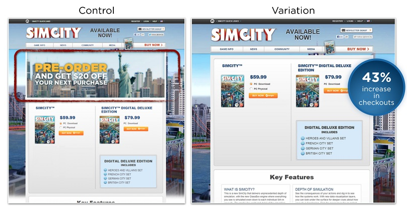
The original landing page had promotional information at the top of the screen, below the menu bar.
It’s simple. Pre-order the game, and you’ll get $20 off your next purchase.
An incentive like this must be good enough to get people to convert, right?
Not so fast. By eliminating this promotional content from the landing page, they saw a 43% increase in checkouts.
Websites with simple designs have higher conversion rates.
Adding too much promotional content to your pages can make it difficult for the visitor to focus on your CTA buttons. Removing unnecessary text can actually be beneficial.
I’m not saying you need to completely trash all of your promotional content. I’m just trying to show you that you have to run experiments to see if it’s worth including.
7. CTA placement
No, you’re still not done testing your CTA button.
Now that size and phrasing are taken care of, it’s time for you to find the best location on the page for this button. You’ll need to run lots of experiments with this.
Typically, your CTA should always be above the fold. Make sure it’s clearly visible at all times.
But test different locations on the page. Try the middle, left side, right side, or even slightly off-center to the right. Try every location.
Experiment with two CTA buttons. Keep running these tests until you find a winner.
8. Image subject
Your website shouldn’t always have a plain white background with no images. You need to use visual elements to improve your marketing strategy.
But don’t just pull a picture out of thin air and assume it will make your website better.
Use A/B tests to find out which images convert the best. Here’s an example of how Highrise experimented with images on its website:
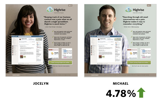
Michael had nearly 5% more conversions than Jocelyn.
This may seem marginal, but depending on the amount of traffic to a website, it could be the difference in tens of thousands of dollars over the course of a year.
9. Navigation menu
How do website visitors find what they’re looking for on your pages?
Typically, navigation menus are the best way for them to jump from page to page. However, if these menus are too complex, it can hurt your conversions.
Remember, keeping things simple is always your best bet.
Take a look at what happened when Yuppiecheif removed the navigation menu from its homepage:
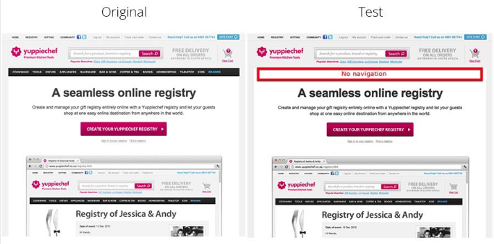
As a result of this design change, Yuppiechef was able to increase conversions by 100%.
If it worked for them, it could work for you as well.
Even if you don’t want to remove your menu completely, you can experiment with other elements of it. Change the color, size, placement.
Consider removing some of the options to keep people focused on converting.
10. Value proposition
Earlier we talked about the importance of free shipping.
But you can test other elements of your value proposition as well. Here’s a look some of the other key phrases that give consumers an incentive to shop online.
By highlighting these other benefits on your pages in the form of a value proposition, you’ll be able to drive more conversions.
Refer to my guide on how to create a highly effective value proposition if you want to learn more about this concept.
11. CTA color
As I said before, your CTA needs to stand out and be obvious in order for it to be effective.
That’s why the color of this button is so important.
Sure, you want the color scheme of your website to be visually appealing, but that doesn’t mean your CTA button should blend in with everything else.
A blue CTA button on a blue background will get lost in the shuffle. And a color like bright yellow will be difficult to read.
So what colors work the best? Run tests to find out.
Here’s an example testing green and red CTA buttons:
Usually, we associate green with go and red with stop. So you could assume that the green CTA button would outperform the red one.
But the results of this test were surprising, which is why we shouldn’t make assumptions.
The red CTA button got 21% more clicks than the green one.
12. Product page layout
On an ecommerce website, the design of your product pages will have a major impact on conversions.
Since these conversions will ultimately translate to dollars, you need to prioritize these A/B tests because a mistake here could be costing you money.
Here’s an example from Smartwool socks:
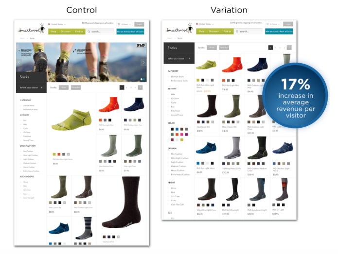
At first, they tried to highlight certain items on their product page.
But after transitioning to a uniform grid system with an A/B test, they saw a 17% increase in the average revenue per visitor.
Try this as well.
Experiment with the number of products you display on the screen at once.
If you have a grid, test rows of three compared to rows of five. Or maybe two columns instead of three columns.
Test the size of your product icons.
After running numerous tests, you’ll be comfortable knowing you have the optimal design for the most important pages on your website.
13. Length of form fields
Test the length of form fields on your landing pages.
For the most part, shorter form fields have higher conversion rates.
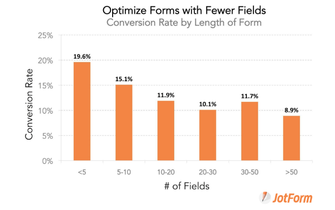
But as you can see from this graphic, that’s not the same across the board.
Right now, if you have six form fields and you can get that down to four, you could assume your conversions will increase based on this graph.
However, some of you may need to have longer form fields if you need to collect lots of information from your customers.
If you look at the data above, it implies that a form with 28 fields won’t perform as well as a form with 40 fields.
So there are certain instances when shorter isn’t always better. Run an A/B test on these forms until you get this figured out.
Conclusion
When it comes to the design elements of your website, you should never make assumptions.
Instead, create a hypothesis, and run A/B tests to test it.
As you can see from the list I’ve created, the CTA button has a huge impact on your conversions. But there are other elements that should be tested as well.
Don’t stop after one test.
You should always be taking steps to improve your design, drive conversions, and ultimately increase your profits.
What elements of your website are you trying to improve with A/B tests?