It’s always great news for a business when their subscriber list starts to grow.
The growing list of subscribers implies that people are interested in your company and you have the opportunity to increase your revenue.
But that’s not always the case.
People ask me all the time why their bottom line hasn’t improved as their subscriber rates increase.
It’s because they don’t have active subscribers.
How do you stay connected and make sure your customers are actively engaged with your content?
Take a step back, and assess your current opt-in process.
It may have some flaws.
Sure, you may see your number of subscribers grow.
But that’s useless if these people aren’t actually interested in your company.
Switching to a double opt-in strategy may be the solution.
I’ll show you how to use a double opt-in landing page to increase conversion rates.
What’s wrong with the single opt-in landing process?
If you don’t know the difference between these two types of landing pages, it’s safe to assume you’re currently using a single opt-in form.
A single opt-in is simple for both you and the subscriber.
They enter their email address and automatically get added to your subscription list.
Here’s an example from Lowe’s Home Improvement:
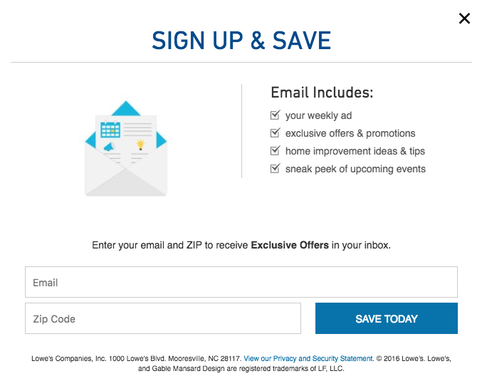
All they ask for is your email address and zip code so that they can send you relevant promotions based on your location.
Once you click “Save Today,” you’ll instantly join the email list.
It’s easy for users, and it’s a great tactic to increase the number of newsletter subscribers fast.
However, there are some problems with this strategy as well.
You may end up with some invalid or useless email addresses on your list.
Here are a few scenarios.
- The customer mistyped their email address.
- The customer intentionally submitted a fake email address.
- Someone signed up for your list by mistake.
People make mistakes when they are typing.
So it’s not uncommon for someone who wants to join your subscriber list to incorrectly enter their email address.
This person may eventually realize the error if they don’t receive any messages from you.
Hopefully, they will go back and submit the correct information.
However, their invalid address will remain on your list.
Sometimes a customer could purposely enter a fake email address if it means they can receive a discount on their order.
To prevent this, you should always email the sign-up promotion instead of automatically applying it to their checkout page.
Here’s an example from Topshop:
It’s also possible that someone entered their email address by accident.
Sometimes people may get confused and think they needed to submit an email address to continue, especially if you have a popup form.
Here’s another possibility.
Let’s say you’re an ecommerce store that requires an email address during the checkout process.
The customer may want to get shipping details and an order receipt sent to their email address, but that doesn’t mean they want to join your newsletter.
Here’s an example:
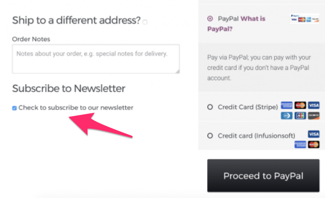
If that box is checked off by default, you may get subscribers who don’t actually want to be on your list.
Depending on your email marketing service provider, you may be paying a monthly, quarterly, or annual fee based on the number of subscribers on your list.
You’ll happily pay if all those subscribers are active and engaged.
But if you have fake emails, invalid names, and people who signed up by mistake, you’re wasting money.
Plus, all of your analytics will be thrown off.
You can’t effectively analyze the success of your campaign without accurate data.
Double opt-in landing pages are more efficient
The double opt-in strategy can eliminate some of the problems we just discussed.
Your company may be experiencing some of those issues if you’re currently using a single opt-in strategy.
So, what’s a double opt-in?
It’s a form that appears after the visitor clicks your call-to-action button.
Here’s what Khol’s double opt-in page looks like:
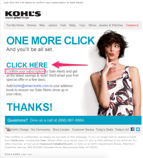
Basically, it’s a two-step verification process.
Sending a confirmation email is another great way to accomplish this.
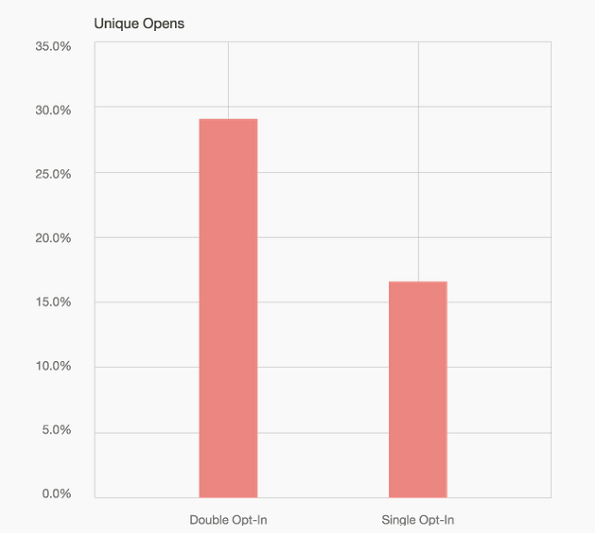
Look at the impact double opt-ins can have on your unique open rates:
Here are some more top benefits of a double opt-in email:
- increased user engagement
- no spam or fake email addresses on your list
- more accurate analytics
- a great way to start a drip campaign
Let’s continue to break down the double opt-in email.
The subscriber has to verify their email address before they get added to your list.
Earlier I mentioned that incorrect or fake email addresses could be plaguing your single opt-in strategy.
This won’t be an issue if you send the prospective subscriber a confirmation message.
Don’t get me wrong.
This isn’t a perfect system either.
Since it requires more steps, some users may not complete the process.
Some people may think the double opt-in emails could be too much.
This is especially true if you’re sending a confirmation message and then a welcome message after their address is verified.
So, here’s what you can do.
Combine your verification email with the welcome message.
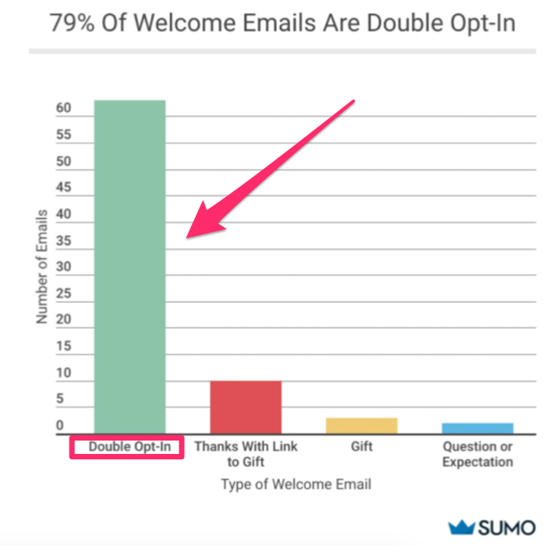
That’s how nearly 80% of email marketers are handling their double opt-in emails.
Otherwise, it can be an overload of messages, which the subscriber could mark as spam.
- Confirmation email
- Welcome message
- Newsletter
- Promotion or discount
That’s potential four messages your subscriber could receive within the first few days of signing up.
It’s too many.
Yes, once they are added to your list, it makes sense to send out a drip campaign.
Just don’t do it all at once.
Space the messages out over a longer period of time so you aren’t perceived as a spammer.
How to create a double opt-in email
Now you understand the basic differences between a single and double opt-in landing page.
It’s time to learn the step-by-step process for your double opt-in email.
Depending on your email service provider, the wording on each page may be slightly different.
In this example, I’ll show you how to set up a double opt-in email on HubSpot’s platform.
Step #1: Select “Double Opt-In” under the “Email” section of “Content Settings”:
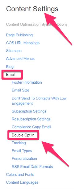
Navigate to the “Content Settings” tab.
Next, click on “Email.”
You’ll see the “Double Opt-in” option about halfway down this menu.
Step #2: Customize the double opt-in message:

From the double opt-in page, click “Edit email.”
This will be the message your prospective subscribers receive after they complete the first step of your opt-in process.
The message should be delivered immediately so the user can proceed and officially join your list.
Step #3: Create a confirmation page and follow-up email:

Once the subscriber verifies their email address and completes the second opt-in phase, they will receive a confirmation.
There are two types of confirmations:
- confirmation landing page
- email confirmation
The landing page will open in their Internet browsing window after the subscriber confirms the first message.
At the same time, they can receive a follow-up message that also confirms their subscription.
If you don’t want your new subscribers to receive too many messages in a short period of time, simply uncheck the “Include follow-up email” box.
I would recommend using this opportunity to send a welcome message to your newest subscribers.
It’s much more practical than another confirmation email.
Step #4: Review the “Enable” options:
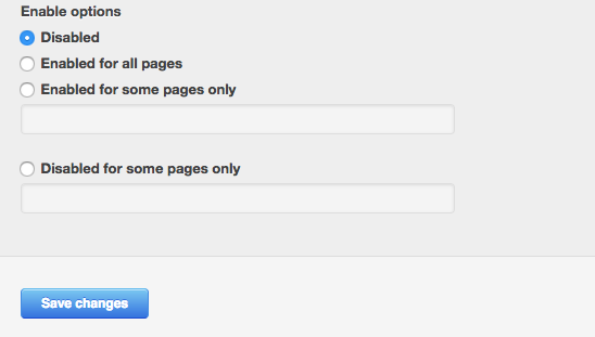
The enable section allows you to choose when to put the double opt-in option on your website.
By default, this option is marked as disabled.
I recommend enabling this option for all your pages.
This will increase the chances of getting higher conversions.
But it’s not required. You can enable your double opt-in on specific pages only.
If you want to include the opt-in on most of your pages, but not all of them, check off the “Disabled for some pages only” box.
It’s pretty straightforward.
Step #5: Manually send an opt-in (optional):
Here’s a scenario.
Let’s say you forgot to change the default enable options in our previous step.
If a user subscribes, they won’t receive your opt-in email verification when the page is disabled.
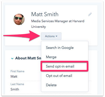
In this case, you can manually send a new subscriber an opt-in message.
Just navigate to your contacts page and click on the user.
Click “Actions” under their name, and select “Send opt-in email.”
That will ensure that your new subscriber receives the message you customized in the second step.
HubSpot’s platform is really easy to navigate and understand.
So if your current email marketing software doesn’t have this feature, you may want to consider signing up for an alternative.
Additional tips for getting sky-high conversions
Before you can send out your double opt-in email, you’ll need the user to click on your CTA button in the first place.
Otherwise, they will never have the opportunity to receive a confirmation message.
One of the first things you should consider is the placement of your opt-in button.
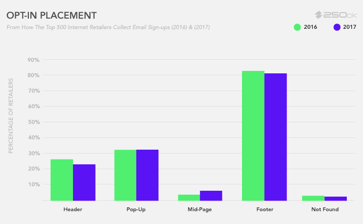
The majority of companies are putting their opt-in CTAs in the footers of their websites.
Just make sure it’s big, bold, and clear so that the visitors can’t miss it.
Your page should also have:
- a strong headline
- a clear call to action
- value and benefits
- social proof of concept
All of these factors can help increase your chances of getting customers to proceed with your double opt-in.
Here’s something else you want to consider.
Timing.
It may sound silly, but it’s one of the most important components if you’re sending a double opt-in email.
Don’t leave your subscribers in the dark.
Especially if you’re putting them through a two-step verification process.
Making the customer wait could lower their interest and engagement.
Maybe they wanted to join your list to receive a promotion or a discount.
If the customer doesn’t get that offer right away, they may be more inclined to make their purchase elsewhere.
Conclusion
If your email list is growing without benefiting your business, you may want to consider changing your opt-in strategy.
While single opt-in forms are simple and a fast way to grow your email list, they are not always effective.
You’ll get some incorrect email addresses that will:
- cost you more money
- increase your bounce rate
- give you incorrect analytics for each campaign
Instead, you can create a double opt-in landing page to increase engagement.
Consider the components of an opt-in email:
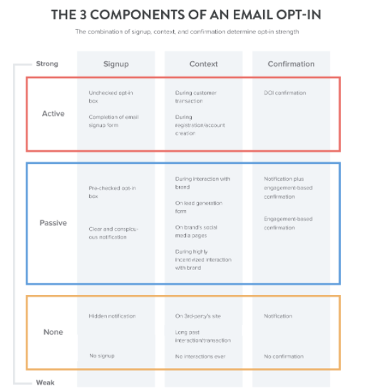
Make sure your message is active.
This will get the subscriber to complete the two-step process and join your list.
A double opt-in also ensures that your subscribers are legitimately interested in your brand, products, and content.
Ultimately, this will increase your conversions.
If your current email marketing software doesn’t allow you to write double opt-in messages, you may want to consider changing platforms.
Then you can follow the step-by-step guide outlined above for creating the perfect double opt-in email.
Make sure your initial opt-in button on your website has a clear CTA. Otherwise, visitors won’t be able to start the two-step process.
How will your offer entice website visitors to confirm their email addresses before officially joining the subscriber list?
