If you currently have a website or plan to build a website, CSS is definitely a term that you’ve come across. But for those of you who don’t know how to code and don’t have any development experience, it can be a little confusing.
Let me start with the basics.
CSS stands for cascading style sheets. It’s a stylesheet language that describes the appearance or presentation of a website. Essentially, CSS tells web browsers how each element in an HTML document should be displayed.
Along with JavaScript and HTML, CSS is a crucial component to every web page on the Internet.
The main benefit of CSS is the ability to separate website content from the design elements, simply by changing rules in a CSS file.
Before CSS was used, nearly every attribute related to how HTML documents were displayed was written in HTML markup. This means that so many rules had to be repeated throughout the HTML code.
But CSS makes it possible for developers to move that information into a style sheet, which simplifies the HTML.
As a result, the HTML is shorter, lighter, and less prone to errors. It also makes your HTML much easier to maintain.
In this guide, I’ll give you some common use cases for CSS and show you my favorite ways to learn CSS online.
CSS common uses
There are lots of different ways to use CSS on your website. But I want to show you some of the more basic and common applications so you can get familiar with how CSS works.
Once you’re able to master these common principles and use cases, you’ll be able to tackle more complex CSS elements in the future.
Font styling
You can use CSS to create a font style. Write properties for elements like:
- Font type
- Color
- Weight
- Size
- Alignment
- Case
- Line height
CSS can also be used to add effects like underlining and strikethroughs. Let me give you an example to show you how this works.
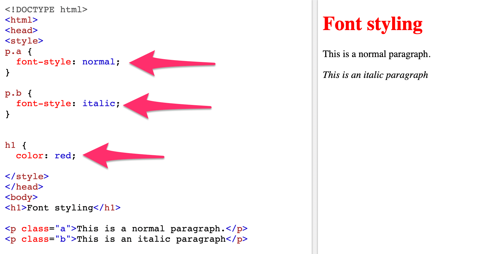
Take a look at the three rules I wrote in the style of this CSS. Property A is a normal font style, Property B is an italic font style, and all H1s are red.
Now when you look at the body, you can see that I wrote the HTML to correspond with those properties. Based on this information, you can see how it would appear on the web page, by looking at the right side of the split screen.
With a simple example like this, you may not immediately see the benefits of CSS.
But now try to imagine a document with 30 or 40 H1s. Based on the properties in this example, all of the H1s would automatically be red, without having to add any additional code in the HTML. If I wanted to change them to blue, all I’d have to do is change the CSS, as opposed to individually going through 40 H1s in the document.
Position properties
Website layouts can be defined with CSS position properties. You can write rules to specifically indicate the position of certain elements within an HTML document.
Common property values include:
- Static — Elements in order, based on how they appear in the document.
- Fixed — Elements are located in a position that’s relative the browsing window.
- Absolute — Elements are positioned relative to its first position.
- Sticky — Elements are positioned relative to a website user’s scrolling location.
If you use the position property to create website layouts, there will be instances where elements on the page overlap with other items. So there could be potential issues with this approach.
There are other ways to define the position of elements on a page, which we’ll get to next.
Float properties
The main usage of the float property is to send an element in HTML to the right or left of another element without changing the flow of the document. This is one of the best approaches to creating layouts for a website.
You’ve definitely seen floats used before when you’re browsing on the web, even if you didn’t know that you were looking at a float.
It’s most commonly used for images. An image can be positioned within a block of text, in a way that doesn’t create separation between the flowing text.
Here’s an example of the float property used for an image.
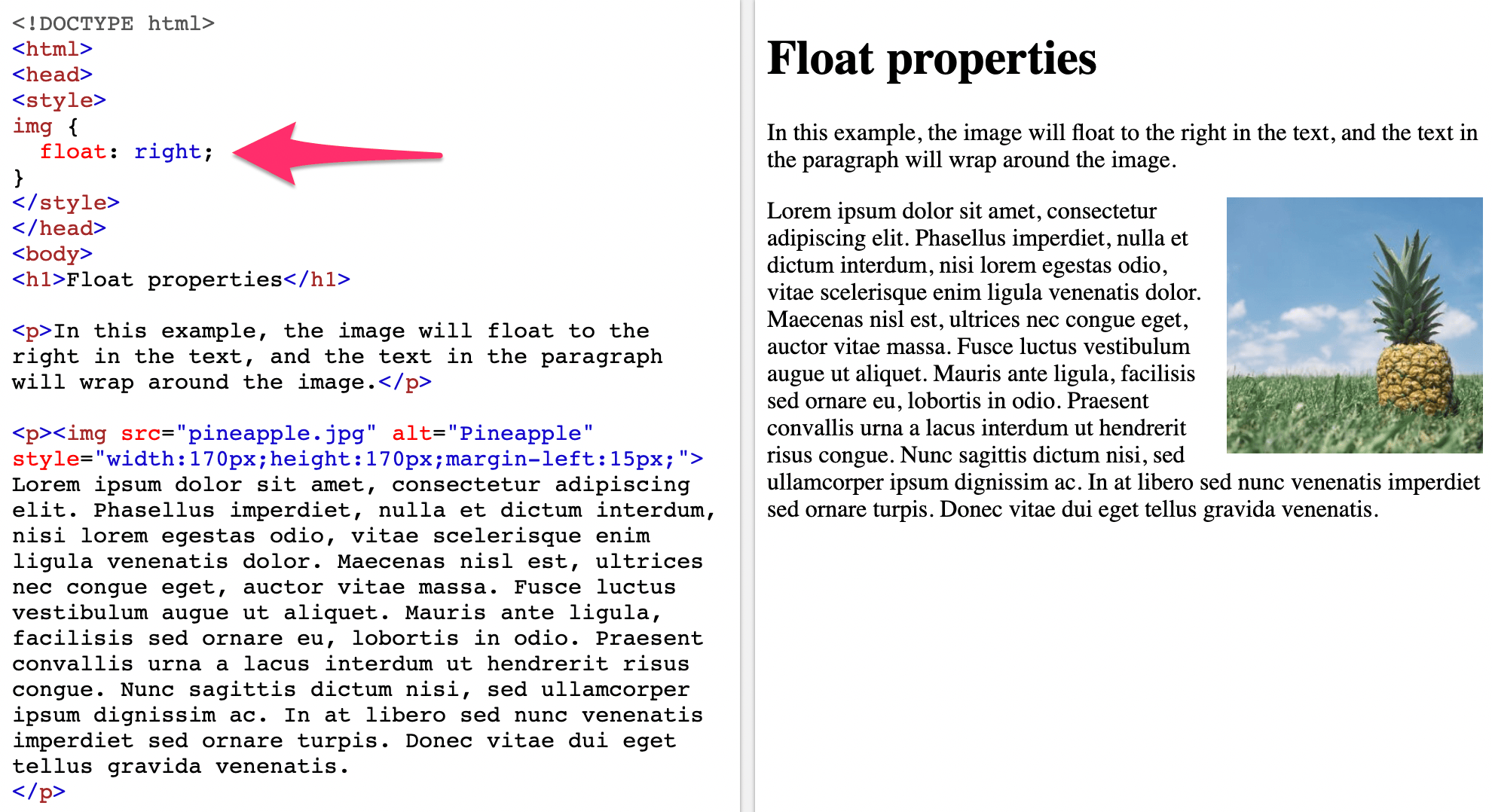
As you can see, the CSS property says that images will float right. So in the body of the HTML when an image is entered, the float property is automatically applied.
Floats are also commonly used for creating website menus. Items in the menu are floated in a way so they can appear in a horizontal line, as opposed to a bulleted list.
Clear properties
The clear property of CSS is often used to clear the float. As you just learned, when an element gets floated, all of the subsequent elements are adjusted so that they align properly based on the float property.
If you want those subsequent elements to begin below a floated element, as opposed to alongside of it, then you would apply the clear property to start the element on a new line.
Here’s a visual representation to show you what this would look like for images.
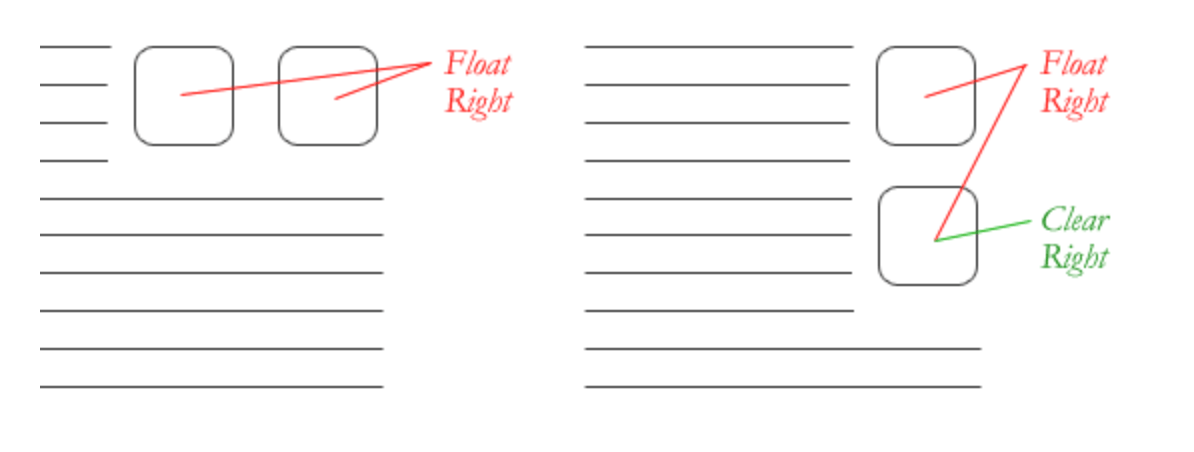
The clear property can be applied to other elements as well, but an image like you can see above is definitely one of the more common practices.
Box model
Every HTML element can be considered a box. When using CSS, the box model refers to the design and layout of a page.
The best way to describe this model is that there is a box wrapping around every element of HTML. There are three main components to the box model.
- Margin
- Border
- Padding
Here’s an example of how you could write a CSS rule for the box model.
P {
padding: 10px;
border: 20px solid blue;
margin: 20px;
}
These CSS properties would translate to 10 pixels of padding on each side of the text. This will be empty space around the paragraph. There would also be a 20 pixel border of solid blue surrounding the padding. Lastly, there would be 20 pixels of margins between the border and any other surrounding element.
Responsive web design with CSS
Today, we have hundreds, if not thousands, of different screens available on the market. This means that people who visit your website can be doing so from countless variations of devices, screen sizes, display sizes, and resolutions.
Having a full-size website with just one additional design for a smaller device is no longer an option. So you need to use CSS to create a responsive design.
In order for this to happen, there are certain principles that you need to follow to ensure that your CSS is responsive on any screen from any device.
Your entire layout and grid needs to be fluid. You need to make sure that images automatically resize to render aesthetically from any screen.
One of the most popular ways to tackle a responsive web design is with a mobile-first approach. This means that the design is made with the smallest screens in mind first, and then styles are added as the size gets larger.
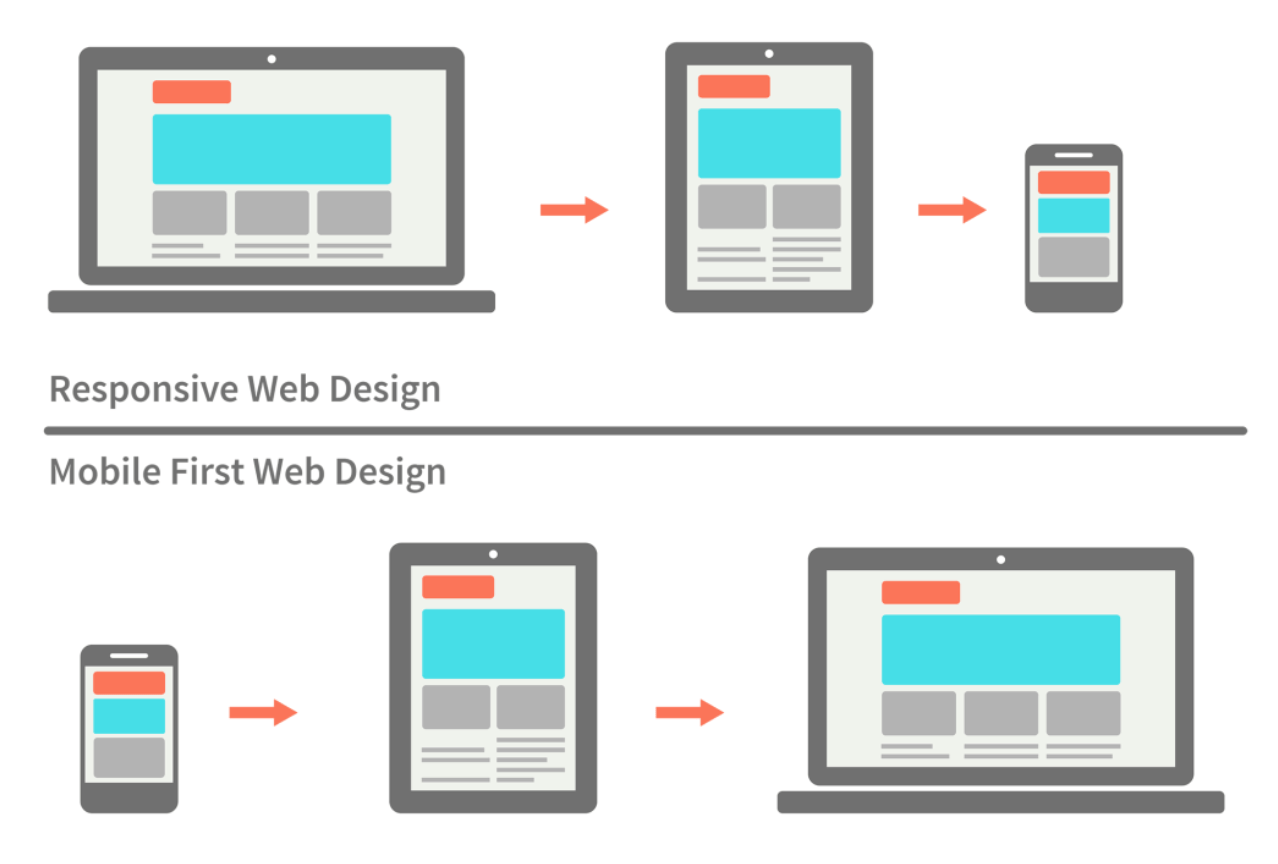
There are lots of great benefits to this approach.
A mobile first design forces you to determine the most essential functions of your website. Once those have been identified, you’ll use them as the foundation and building blocks for the site’s design.
More often than not, a full-sized website has additional elements that aren’t viewed on mobile versions of the site. But a mobile-first approach ensures that all of the primary purposes and functions will be at the forefront of the design.
It’s also worth noting that this approach means mobile users won’t have download as many site resources and CSS rules when accessing a website from a mobile device. This will save data usage for the user, create faster loading times, and an overall better user experience.
CSS learning resources
Everything I’ve covered so far just barely scratches the surface with CSS. I just wanted to give you an introduction so that you’d have a better understanding of how it works.
But for those of you who want to learn CSS beyond a beginner level, there are some great tools and resources online for you take advantage of. I’ve narrowed down a couple of my favorite options.
Codecademy
Codecademy is one of the top platforms for learning to code online. Over the last seven years, more than 45 million people have learned to code with their system.
Nearly 500,000 of those people have taken the CSS course. It takes about 15 hours to complete, and you’ll need to take their introduction to HTML course as a prerequisite. So altogether you’re looking at roughly 22 hours of your time to learn CSS.
Codecademy will teach you how to style web pages with file structures, text edits, colors, and various layouts. You can use these skills to customize your web pages.
The class also covers:
- CSS selectors
- Visual rules
- The box model
- Displays
- Positioning
- Typography
- CSS grids
As you can see from this list, some of these subjects we discussed in this guide. So you’ll already have a basic understanding of some principles, which will give you a head start.
You’ll have access to some of these courses for free, but to get the full experience I’d recommend upgrading to the pro version of Codecademy.
Pricing is $19.99 per month for an annual contract, which is the best deal they have. Otherwise, you’d pay $29.99 or $39.99 for a six-month or month-to-month contract, respectively.
W3Schools
W3Schools has tons of free coding resources. In fact, I used their free editor twice for examples in this guide. The font styling and the float CSS that I showed you earlier were both written on the W3Schools platform.
I like this resource because it’s very simple and hands on.
First, they explain how a certain function or property works, then they show you an example. After that, they make it easy for you to practice with those examples by making changes to the CSS on your own.
There are more than 300 different CSS examples on the W3Schools site. You can test all of these with their editor.
Take advantage of their CSS templates, CSS exercises, and CSS quizzes as well.
For those of you who have an interest in pursuing web development or web design, you can also get a CSS certificate from W3Schools. Although this is something that you’ll have to pay for.
After you complete the training, you can take a 70 question exam, which you’ll have 70 minutes to complete. If you get 75% of those questions correct, you’ll pass and get a certification. If you get 95% of your answers correct, you’ll have a notation of excellency added to the certificate as well.
The CSS certificate program from W3Schools costs $95.
Conclusion
CSS is a crucial component of every website. You can use it to simplify your HTML, and ultimately reduce the complexity of your HTML files.
There are tons of different ways that CSS can be used. But as a beginner, I didn’t want to overwhelm you with too much at once.
With that said, the information in this guide is still very useful for anyone who is interested in learning more about CSS, so keep it as a reference for the future.
For those of you who want to take your CSS knowledge to the next level, try out one of the online resources that I mentioned above.
