
The Databox analytics platform provides real-time access to all kinds of tracking data, giving businesses the ability to monitor performance in a variety of areas.
The cloud-based Databox software also presents the data in easy-to-understand charts and graphs, giving the user helpful context.
Although quite a few of the best data visualization tools can help businesses interpret their data, Databox sets itself apart by focusing on usability.
Rather than needing quite a bit of technical know-how to figure out how to read the data, Databox simplifies the process without the need for significant customization.
Databox allows users to customize the dashboards to show them the most important information, but it doesn’t require this step like more complex software does.
Databox Pros and Cons
Pros
- Clear interface
- Simplifies comprehending complex data sets
- Allows basic customization of dashboards
- Integrates easily with Slack
- Can send reports to anyone
- Allows users to set goals
- Quickly pulls in data to use
- Can update data in real-time
- Allows branding
- Easy to use
Cons
- Some integrations are tricky to set up
- Lacks extensive customization features
- Difficult to select custom ranges for data analysis
- Limits on the number of simultaneous dashboards
- Upper tiers become expensive quickly
How Databox Compares to Top Data Visualization Tools
Databox successfully performs the basic processes of creating graphs, charts, tables, and other means of visualizing data. It is among the most straightforward software packages to use in this category.
However, although it has some customization features, Databox trails some of the top tools in terms of overall customization.
Zoho Analytics is an excellent choice for those without significant technical know-how to have the ability to create simple reports for analyzing data. It also has quite a few high-end customization options to display the data in the most useful way.
For companies that need business intelligence tools along with data visualization help, Tableau is easy to recommend. It helps businesses that must deal with high-level data make sense of the information. It also offers the ability to create charts that excel in analyzing complex data, such as tree maps, histograms, and heat maps.
There’s no single data visualization tool that will meet the needs of every business. Organizations need to take some time to figure out what they want from this tool. They then can find the software package that best meets their needs.
We’ll break down how Databox compares to some of the best products in this category.
Databox Data Formats
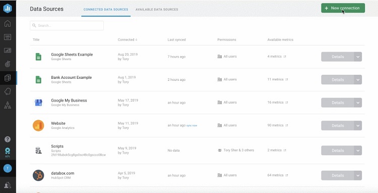
Users can connect Databox to a variety of sources of data. The software can sample data from the most common data formats, simplifying the process of generating useful charts and graphs.
To find data, users could start with Google Sheets. With the top two paid tiers of Databox, users have access to built-in integrations with multiple SQL databases and Google Sheets.
Users can pull data into Google Sheets from another source before connecting to Databox. Or users can simply pull raw data into Databox that they entered manually into Google Sheets.
When pulling data from a Google Sheets spreadsheet, Databox will accept a file with up to two million cells of data.
Regardless of which pricing tier the business is using, Databox can use multiple data source connections. However, customers will have to pay extra to use more than three data source connections.
Analyzing Big Data
Databox works nicely for basic data sources. When seeking to analyze big data, however, Tableau will be the top choice among data visualization tools. Tableau works well for large businesses with detailed requirements for analyzing data.
Large businesses can undoubtedly use Databox to analyze big data. But it will require complex file conversions that need significant technical expertise to analyze successfully.
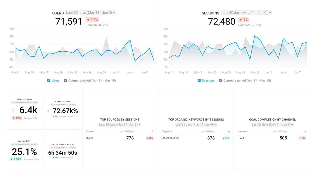
Databox Visualization Methods
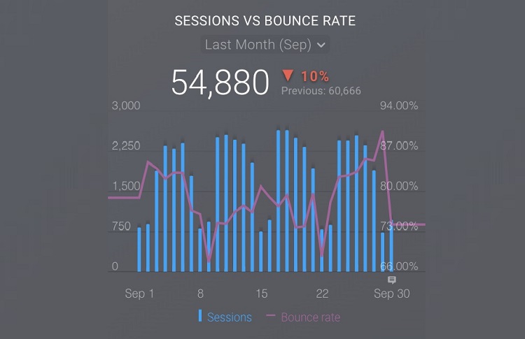
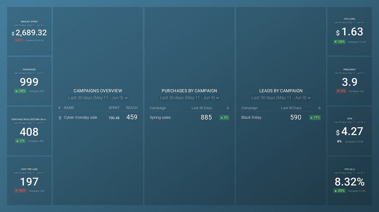
Databox offers a variety of visualization types that businesses can use to display their data. Through the Databox dashboard, users can select from more than a dozen different charts and graphs. Some of the available visualization types include:
- Advanced table
- Bar graph
- Combo chart
- Compare
- Funnel
- Gauge
- Heat map
- Image
- Interval
- Leaderboard
- Line graph
- Multi-tab chart
- Number
- Pie chart
- Pipeline
- Progress bar
- Table
- Text
Databox can create many charts and graphs, but it doesn’t offer highly complex graphs. For those types of charts and graphs, consider Tableau instead. It can make the same basic graphs available in Databox, but can also create histograms, cartograms, and bubble clouds, among others.
For businesses that need to create interactive maps for displaying data, Datawrapper offers a wide range of maps, charts, and tables. Datawrapper especially excels in map creation, offering symbol maps, locator maps, and base maps. Users can select among worldwide maps, country maps, and regional maps, displaying the company’s data in a unique way.
Databox Specialty Solutions
Some data visualization tools work better for specific types of industries, offering specialized features. However, Databox carries features that will help nearly any kind of industry or business. It’s more of a general-use data visualization tool.
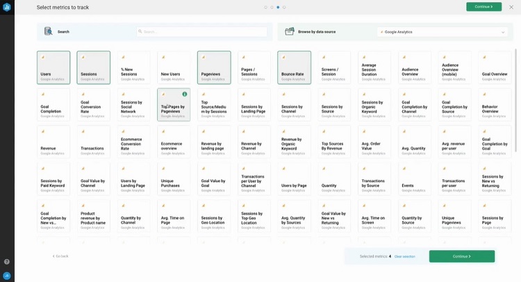
Users can select among several dozen pre-loaded metrics when creating charts and graphs, which allows them to tailor the results to meet the needs of specific industries.
Configuring Databox for Agencies
For those seeking a bit of specialization from Databox, the software does allow users to specifically set up a dashboard for analyzing data for an agency type of business.
When signing up with Databox, users can select an account that uses general features, such as tracking and charting data from their own business or team. Or users can choose the agency mode. It contains features aimed at helping a consulting firm or marketing group track the performance of their clients.
Other Specialization Options
If seeking a data visualization tool specifically for marketing agencies, Whatagraph is a software package with a bit more specialization than Databox. Whatagraph focuses on helping an agency deliver data that shows the results of marketing campaigns in progress or just completed.
Whatagraph makes it easy to apply brand names to the reports, helping you customize the reports to your agency’s customers.
For data engineering businesses, Sisense is a great tool for monitoring and displaying data. Sisense does require some technical savviness to make the most of the data, as customization is a key part of making Sisense work. But it delivers useful results from highly complex data sets that other data visualization tools often struggle to handle adequately.
Databox Sharing and Collaboration
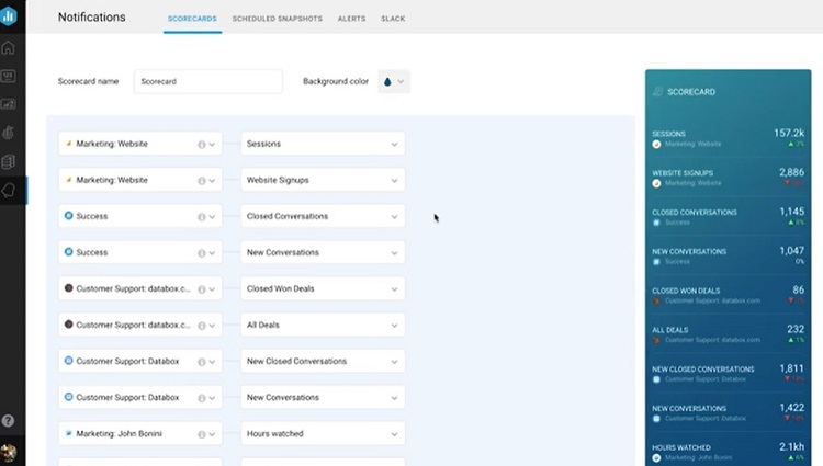
Once a business has Databox charts and graphs from its data in hand, sharing those charts with clients and other team members is an important feature. Through Databox, users can share the information via email, mobile notifications, or a Slack integration.
Databox users can use the software’s Scorecard feature to create specific information about how the business performs in certain metrics. Businesses can even make a Scorecard that shows the performance of an individual salesperson.
Additionally, through the Databox dashboard, users can push their charts and graphs to social media accounts, including Facebook, Twitter, Instagram, and LinkedIn.
For those using the agency mode of Databox, it’s possible to create client reports automatically. Clients can access these reports, learning more about how their marketing campaigns are working.
For one of the strongest data visualization tools in terms of collaboration, consider Infogram. The sharp-looking visual reports in Infogram are perfect for displaying on websites or through social media accounts, as they’ll grab attention. Users can customize Infogram’s charts for mobile display too.
Databox Pricing
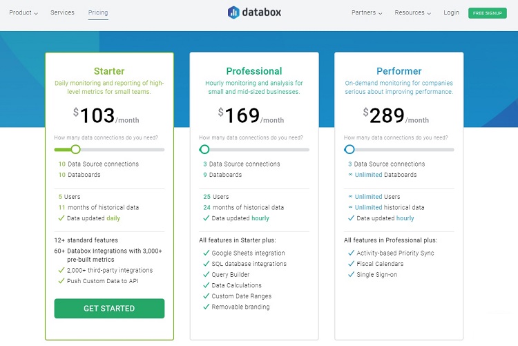
Databox has three pricing tiers available, as well as a completely free version.
Free Tier
Databox aims its free tier at small teams that want daily reporting options for their data. Those who need more frequent data synching will need to subscribe to an upper pay tier.
The free tier allows for up to three data source connections, along with one databoard per data source connection. This tier allows up to five users.
Those using the free plan can use any of Databox’s more than 2,000 integrations with third-party apps and software.
Databox will store up to 5 GB for the account holder in the free tier, and up to 11 months of historical data is available.
Those who choose the free version can continue using it forever, as this is not a limited-time free trial.
Starter Tier
The Starter tier has the same features as the free one, but customers can use more than three data source connections.
With four data source connections, the Starter tier costs $91 per month. The price will increase a bit for each data source connection the customer needs to use. There’s a limit of 50 data source connections.
Professional Tier
The Professional tier offers the same features as the previous tiers, along with several advanced features. Databox aims the Professional level at small- and mid-sized businesses that need monitoring and analysis of data on an hourly basis.
With the Professional tier, Databox allows for up to 25 users on the account. Users can pull historical data from up to 24 months back. Databox will store up to 20 GB of data per account at this tier.
Professional tier users will be able to make use of the third-party integrations, as well as Databox’s built-in SQL integrations and Google Sheets integration.
The Professional tier cost starts at $169 per month for up to three data source connections and up to three databoards per data source connection. The price in the Professional tier increases slightly for each data source connection up to 50 data source connections.
Performer Tier
The Performer tier will work for any size of company that needs real-time and on-demand monitoring of data. It offers all of the features found at the Professional level, plus a few others.
Databox allows for an unlimited number of users in the Performer tier and unlimited access to historical data.
This tier costs $289 per month for up to three data source connections. The price increases for every data source connection added up to 50 data source connections. The Performer tier offers an unlimited number of databoards.
Databox Integrations
One of Databox’s strongest features is its ability to integrate with a large number of third-party software packages and apps. The integrations simplify the process of pulling data from software the company is already using. The company then can run reports and charts based on this imported data.
Many of these integrations are easy to install in Databox, dozens of which require just a single click to start the process. Some of the integrations available through Databox include:
- Google Analytics
- Google Ads
- Google Play
- Facebook Ads
- Facebook Pages
- Facebook Groups
- LinkedIn Ads
- LinkedIn Pages
- Twitter Ads
- Instagram Business Account
- Microsoft Advertising
- HubSpot
- GitHub
- MailChimp
With many of Databox’s primary integrations, such as Google Analytics, multiple built-in templates are available. These simplify the process of building charts and graphs that take full advantage of the data obtained through the integration.
Zoho Analytics is another visualization software tool that offers a large number of helpful integrations. With Zoho Analytics, users can pull data from sales software, financial software, marketing software, social media software, and help desk software.
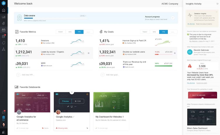
Databox Goal Tracking
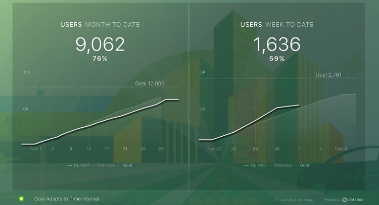
For companies that want to pair their data tracking with goal setting for individuals, teams, and the business as a whole, Databox has an outstanding goal tracking feature.
Teams can set their goals first. They’ll then use the data pulled into Databox to clearly show the progress toward the goals.
Sharing this information with the entire team regularly makes it easy to see where the team’s focus needs to be to hit the desired goals.
Helping With Setting Goals
As part of the process of setting up the charts and graphs that show the progress toward a goal, Databox allows users to make use of the actual data in the software to set the goal targets. Rather than just picking a random number to set a goal, users can take the data already in Databox and create a realistic number.
The Databox software allows for setting weekly, monthly, quarterly, and annual goals for an entire organization, team, or individual. The visualization options for displaying progress toward the goals include:
- Bar chart
- Gauge chart
- Line chart
- Numbers
Each of the goal charts displays clearly on the vertical orientation of a smartphone device screen. This gives team members the ability to easily monitor the progress toward the goal in and out of the office.
Other Goal Setting Options
Among the best data visualization tools, Infogram also has a strong goal setting and tracking feature.
Beyond helping users set the goals based on realistic data points, Infogram users can create timelines to show specific goal dates for hitting certain milestones. Users can even set up motivational updates that team members can regularly receive to encourage them to progress toward the goal.
Conclusion
Databox is extremely easy to use, which gives it a leg up for small- and medium-sized businesses. Users won’t have to spend a lot of time creating significant software customization to gain benefits from it.
For those businesses that need high-end data analytics and the ability to drill down to specific numbers through customization, other options probably will work better. But Databox’s simplicity makes it a popular choice for the organization that wants a better understanding of its level of performance without a lot of hassle.