
Ecommerce websites live and die by their conversions.
For those of you who have a high volume of traffic to your website, that’s great news. But traffic alone doesn’t generate sales.
Is your website traffic translating to conversions?
There are certain metrics you can use to measure this. Look at your bounce rates. Analyze your shopping cart abandonment rates.
If your website visitors aren’t converting, your ecommerce site won’t make money.
Don’t get me wrong: the products you’re selling might be amazing. That’s not necessarily the issue here.
The design of your website and the checkout process might be what’s hurting you.
For the most part, simple website designs have higher conversion rates. This same concept needs to be applied to your checkout process.
The information in this guide will help you identify any flaws with your checkout procedure that could be hindering your conversions.
If you have just launched a startup company and are in the process of designing your website for the first time, these useful tips and best practices will help you as well.
Here’s what you need to do to design a checkout process that converts.
Add multiple checkout buttons
For website visitors to make a purchase, they need to be able to navigate to your checkout page.
Once someone decides to buy, they’ll add the items they want to their shopping cart. In a perfect world, you want them to continue shopping so they spend more money.
But if the checkout buttons aren’t clearly labeled, the customer may ultimately leave the items in the cart without buying them.
This could be why your shopping cart abandonment rates are so high. Instead, include checkout buttons on both the top and bottom of the screen.
Check out this example from the Champs Sports website:
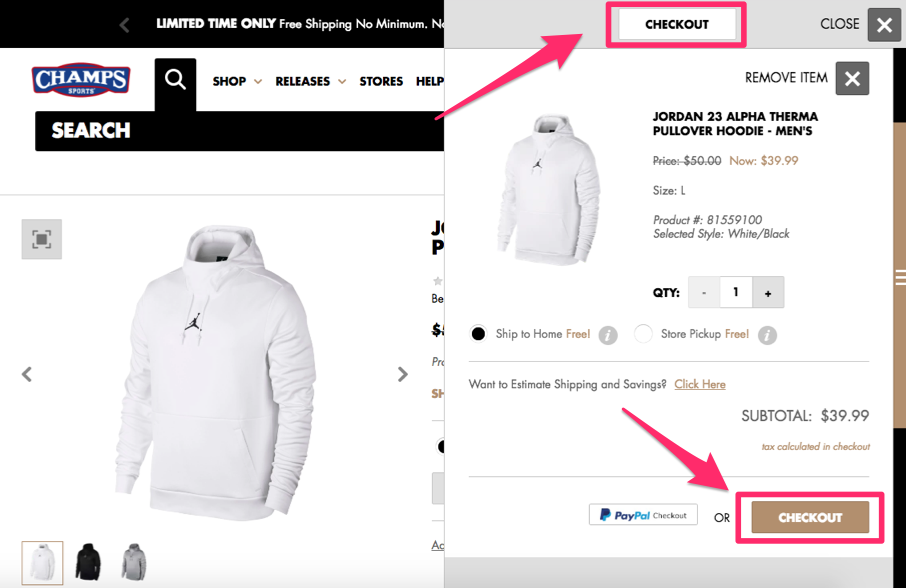
Positioning the checkout buttons in two places ensures the visitor will see and have access to both buttons.
The word “checkout” will stay in their line of vision, regardless of where they’re looking on the screen.
I also want you to notice that the location of the shopping cart on the right side of the screen allows the customer to continue shopping on the left.
This increases the likelihood that the average order amount will be higher and conversion rates remain high as well.
You can implement the same strategy on your ecommerce page to drive sales.
Secure the checkout process
Security needs to be a top priority for your ecommerce site. If your pages appear untrustworthy, people won’t want to buy anything.
In the past five years alone, 46% of people in the United States have been affected by credit card fraud.
There’s a high probability that nearly half of your website visitors have experienced this. Even if they haven’t personally fallen victims to fraud, I’m sure they know at least one person who has.
This puts people on high alert.
If your checkout process isn’t secure, people won’t feel safe entering their credit card information, which is ultimately what you need to make money.
You must understand and implement the top elements that add credibility to your website.
All pages of the checkout process must be secure. It’s also in your best interest to include security badges, such as Norton, McAfee, or whatever else you’re using to protect your customers.
Eliminate shipping costs
Here’s a common mentality I see from ecommerce sites all the time. If it costs you money to ship your products, that means you should charge your customers for shipping, right?
Wrong.
While this may sound like a reasonable justification to you, your customers don’t see it that way.
In fact, shipping costs play a major role in why shopping carts are abandoned in the United States:
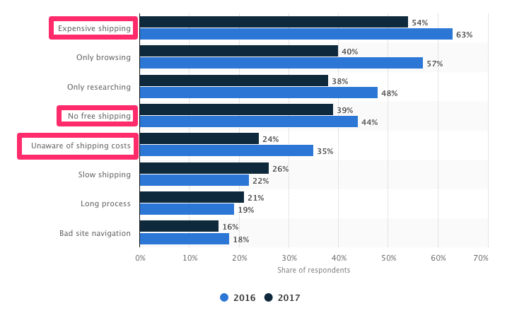
Do not charge your customers for shipping.
But you still need to make sure you’re turning a profit, even if you’re offering free shipping.
You’re better off raising the prices of your items so that the shipping costs are built into the base prices. Psychologically, this won’t impact your conversions.
That’s because customers won’t be surprised when they see additional charges when they check out. If your product is listed for $50 on the site, that’s what they expect to pay. But if the costs add up to $70 with taxes and shipping, it’ll hurt your conversions.
I’m not expecting you to be unrealistic here. Don’t ship your customers a piano overnight for free.
All I’m saying is you shouldn’t charge for standard ground shipping. If a customer wants the delivery to be expedited, you can let them pay an additional charge.
Reduce the number of form fields
A website visitor is ready to buy something. They’ve already made up their mind.
Don’t give them a chance to change their mind and abandon the cart. If your checkout process is long and complicated, you won’t have high conversion rates.
But if you can simplify the process by eliminating unneeded steps, you’ll make more money.
Ask yourself what information you really need from the customer to complete the purchase. Do you need the customer’s name?
Yes, but you don’t have to ask for it several times.
If a name is required to process the payment method or shipping information, don’t make them type those details twice.
Research shows that websites with fewer form fields have a higher performance rate during checkout:
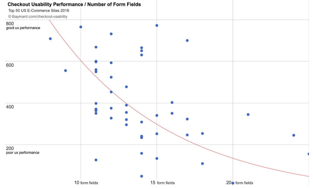
Only ask for information required to complete the transaction.
If the customer’s shipping and billing addresses are the same, they should be able to check off a box indicating that—instead of having to type their address twice, for shipping and billing.
That alone shaves an extra step off the process and significantly reduces the number of form fields.
Offer a guest checkout option
I get it. You want to learn as much information about your customers as possible.
In a perfect world, everyone who visits your site will create a customer profile. This allows you to monitor their browsing behavior and suggest items to them based on this behavior and their purchase history.
Customer profiles allow you to segment your audience based on the customers’ locations and make it easier for you to add subscribers to your ecommerce email list.
When a customer is browsing from their customer profile, they can also place repeat orders with just a couple of clicks.
Customers can save their payment information to their accounts, which reduces the number of steps in the checkout process and makes it easier for them to convert.
If you’re encouraging customers to create a profile, I’m all for it.
But there is a big difference between encouraging and forcing. Does a website visitor need to have a customer profile to convert? Absolutely not.
Forcing people to create a profile could be hurting your conversions.
People want to buy something. Let them give you their money.
Don’t prioritize your content marketing strategy over actual sales. Here’s an example of how a global giant Walmart implemented this strategy:
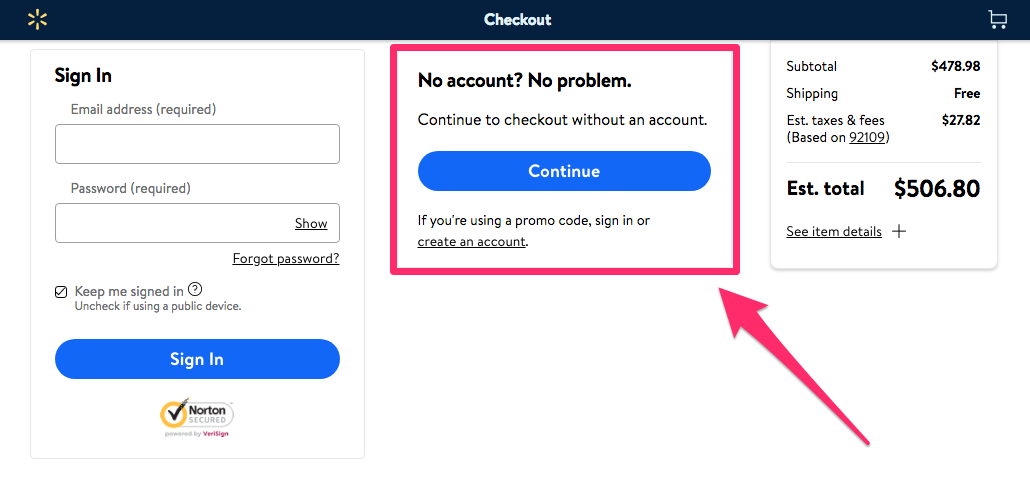
It’s always a good idea to follow the lead of the companies that have had major success in a particular space.
Offering a guest checkout is also reduces unnecessary steps, which I discussed earlier. Creating a customer profile is not necessary to complete a purchase, so don’t make it so. Otherwise it will turn some customers away.
Make it easy to shop from mobile devices
It’s no secret that we’re living in a mobile world. Ecommerce brands need to recognize this if they want to succeed.
In fact, 62% of people who own a smartphone used their devices to make purchases online within the last six months alone.
It’s estimated that in the next three years, mobile retail sales will control 54% of the ecommerce market share in the United States.
Why is this the case?
It’s because technology has made it more convenient to shop from mobile devices.
People aren’t walking around with laptops in their pockets all day. But phones are seemingly always within an arm’s reach, if they’re not already glued to the consumers’ hands.
If someone visits your ecommerce site from a mobile phone, they need to have a great experience.
If your site isn’t optimized for mobile devices, there’s a slim chance you’ll be able to generate conversions.
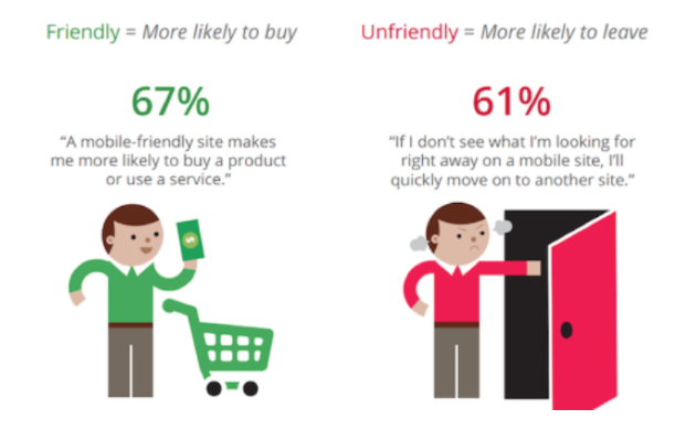
Just look at these numbers.
The design of your mobile site can be the difference between customers buying something or bouncing and buying from your competitors instead.
But 74% of mobile users are more likely to revisit websites that are mobile-friendly.
If your site is properly optimized, it will increase the chances of your website visitors not only converting but also coming back and buying again in the future.
A/B test the elements of your checkout process
You can never truly be sure your checkout process is designed for the maximum number of conversions unless you put your theory to the test.
The best way to determine which elements are driving the highest conversions is through A/B testing.
If you’ve never run an A/B test before, the concept is very simple. You start by identifying one element of the page you want to test.
Then 50% of your site traffic will see version A, while the other 50% will see version B. Compare the conversion rates between the two variations to see which one yielded the best results.
When testing the checkout page, it makes sense to start with the “purchase/buy now” button, or whatever your final CTA button is that completes the transaction.
There are lots of potential tests you can run on this button:
- size
- color
- placement
- wording
Test only one element at a time.
For example, let’s say you test the conversion button at the bottom right side of the screen compared to the bottom left side of the screen.
Once you have conclusive results, you can implement that change and then move on to testing the wording of the button, e.g., “purchase” versus “buy.”
Accept alternative forms of payment
Ultimately, the most important aspect of a checkout procedure is the payment step.
Without the payment step, transactions can’t happen.
From your perspective, you may think it’s in your best interest to accept only certain credit cards. I know you pay higher transaction fees for some cards compared to others.
That said, you need to accept as many payment methods as possible, including alternative forms of payment:
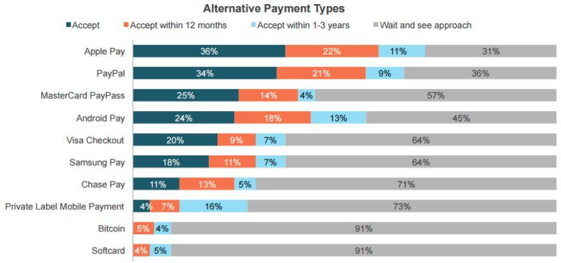
Let’s not get carried away here. In 2018, it’s probably not necessary to accept Bitcoin and other cryptocurrencies.
But in addition to all major credit cards, you need to accept alternatives such as Apple Pay and PayPal.
You don’t want your customers to leave your site without buying anything because you don’t accept the payment method they want to use.
Even if they have the options you accept, they still may go to one of your competitors instead so they can use their favorite method of payment.
The days of accepting only Visa and Mastercard are over. It’s time for you to adapt and add these other payment options to your checkout process.
Conclusion
If you’re driving lots of traffic to your ecommerce site but those visitors aren’t converting, you need to analyze the design of your checkout process.
Add multiple checkout buttons to different areas of the page.
Customers care about security, so the entire checkout procedure needs to be safe and secure.
Do not charge for shipping. Eliminate unnecessary steps, and reduce the number of form fields required to make a purchase.
Don’t force your site visitors to create customer profiles. Have a guest checkout option.
Optimize your ecommerce site for mobile devices.
Use A/B tests to see which design elements maximize your conversion rates.
And accept as many forms of payment as possible.
If you follow these best practices, your ecommerce checkout process will yield high conversions and, ultimately, increase your profits.
What elements of your checkout process do you need to change to drive higher ecommerce conversions?